[Context]
Metaforms sells to research teams who read carefully and trust slowly. The site needed to feel closer to a well-edited publication than a typical AI startup landing page, and there was no visual language yet to carry that across pages.
[The elephant]
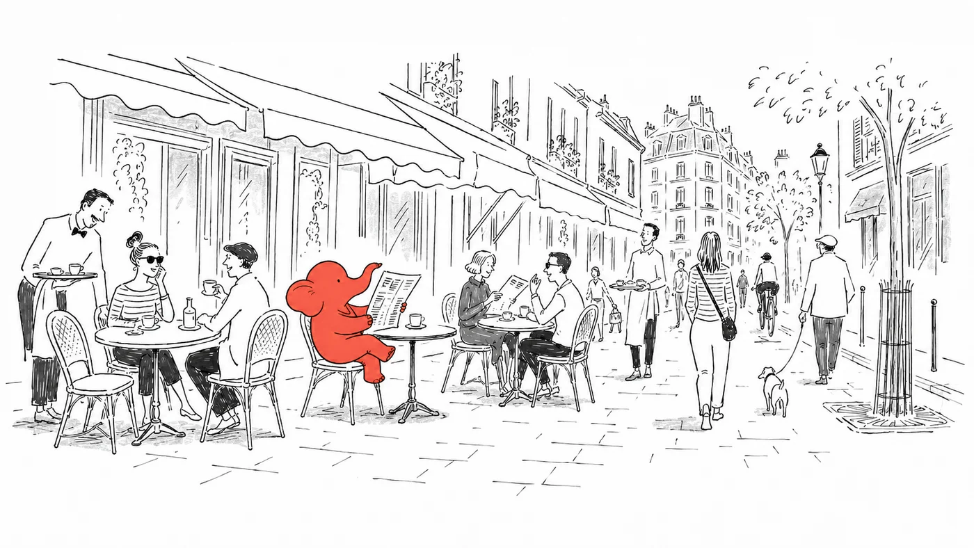
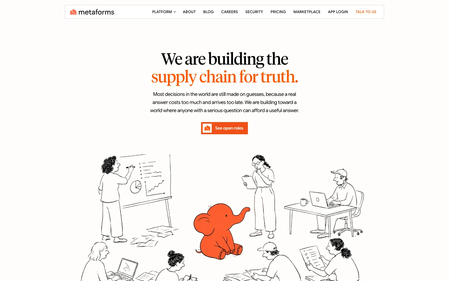
The brand is built around an orange elephant: the elephant in the room, the bottleneck every research team knows about. Fine ink line, one flat orange, and the only colored thing in any composition.





[Brand guidelines]
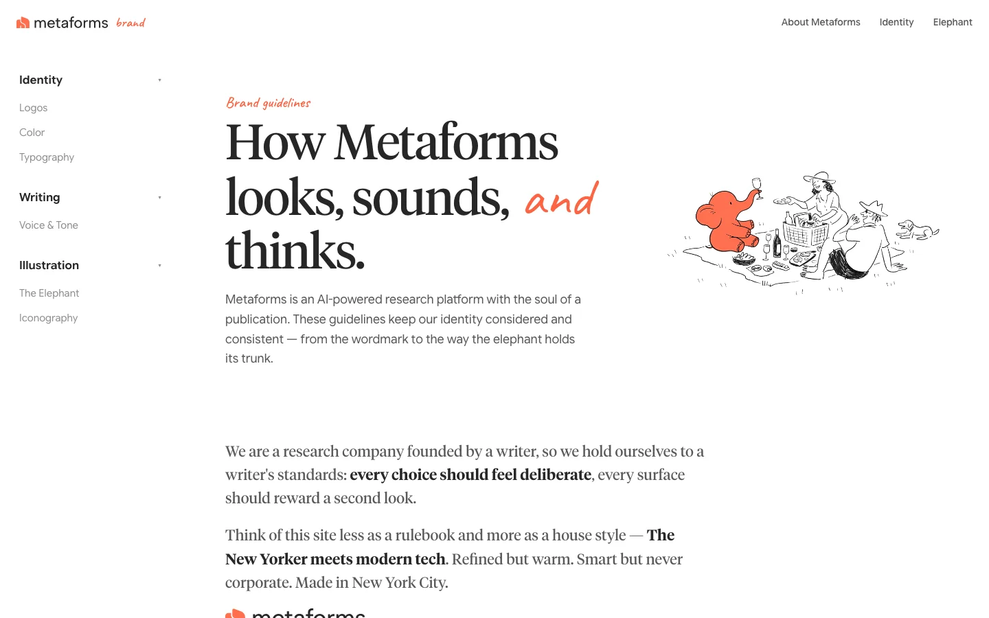
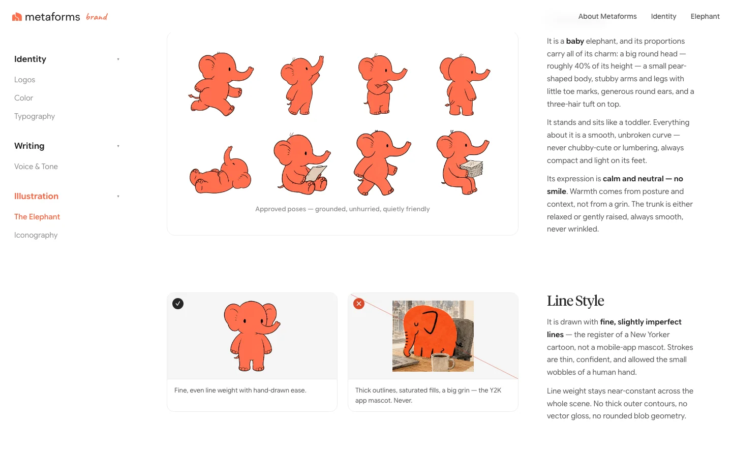
I built the guidelines as a live site: logo, color, type, voice, icons, and how to draw the elephant. A house style rather than a rulebook, The New Yorker meets modern tech.
[Homepage]
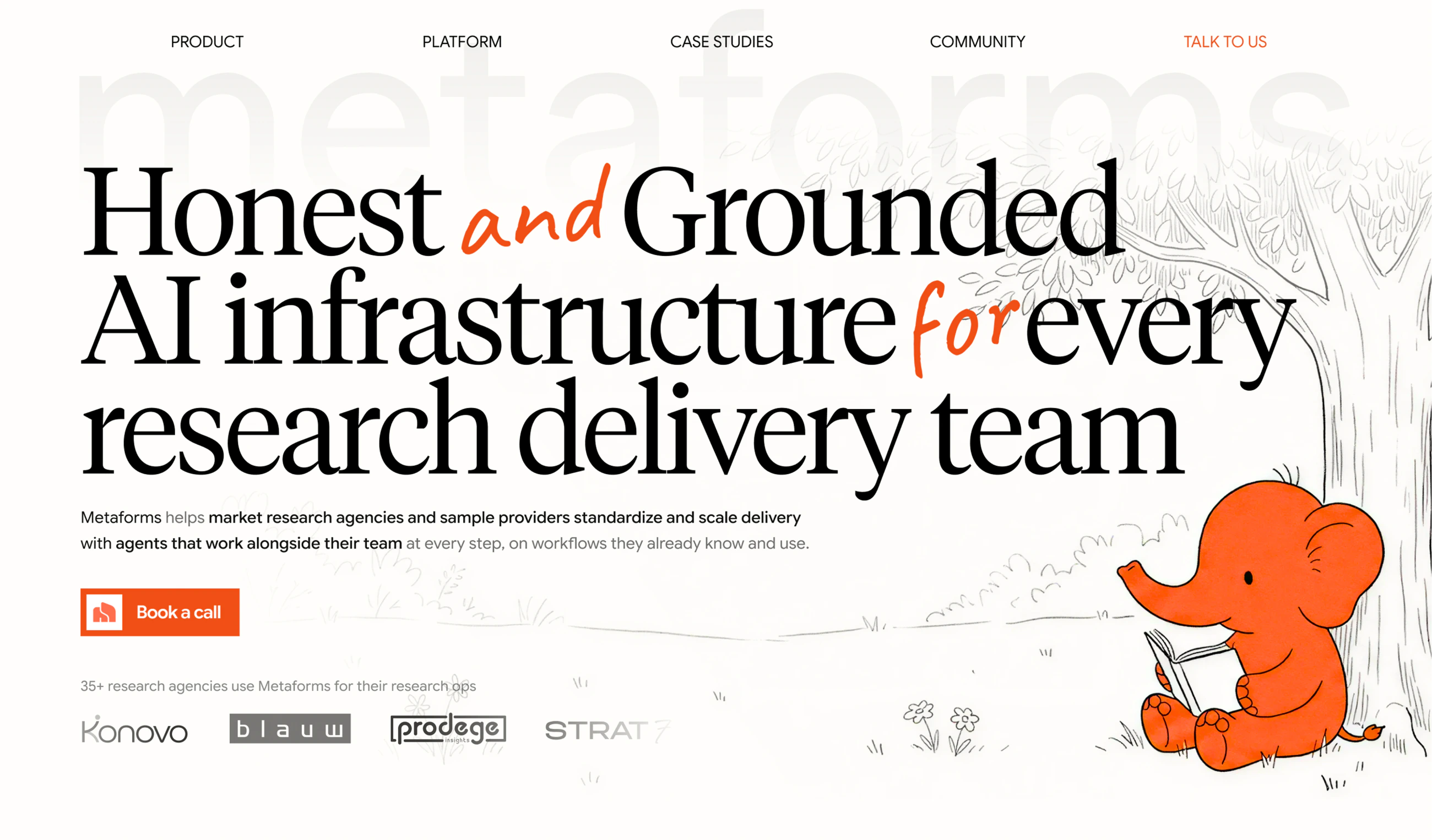
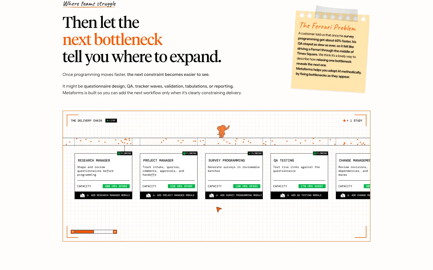
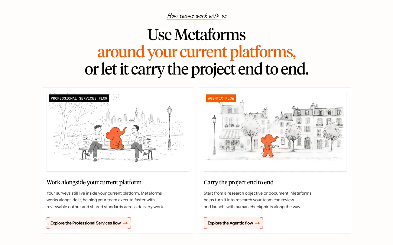
The homepage had grown to around nineteen sections. I consolidated it to thirteen, so each section earned its place and the argument built in order: what Metaforms does, how it works, why it's trustworthy.
[About]
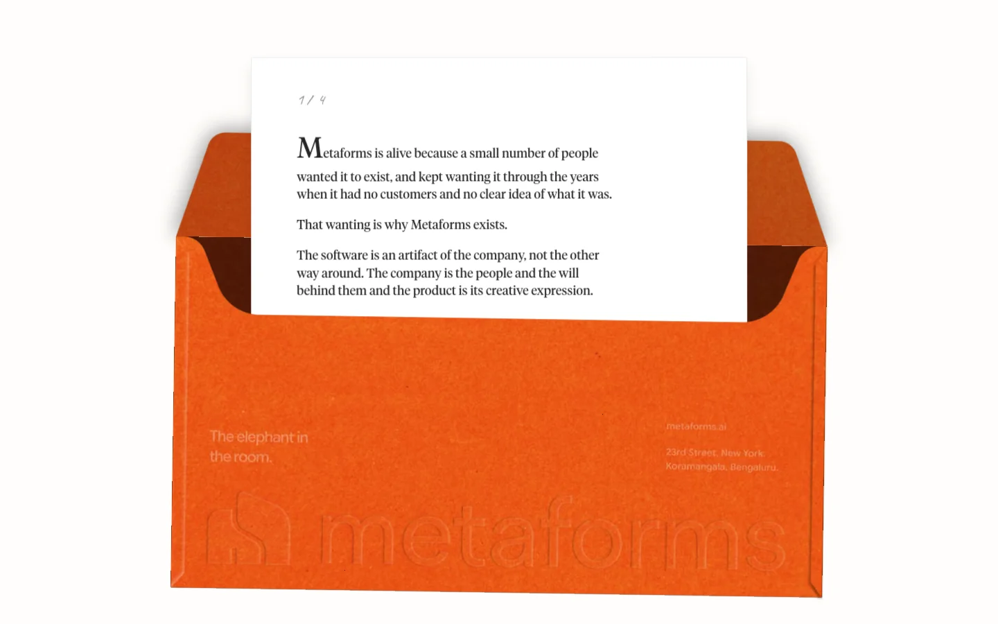
The centerpiece is an interactive envelope with a working flap and paper grain texture. As you scroll, letters slide out with the company's story.
[Careers]
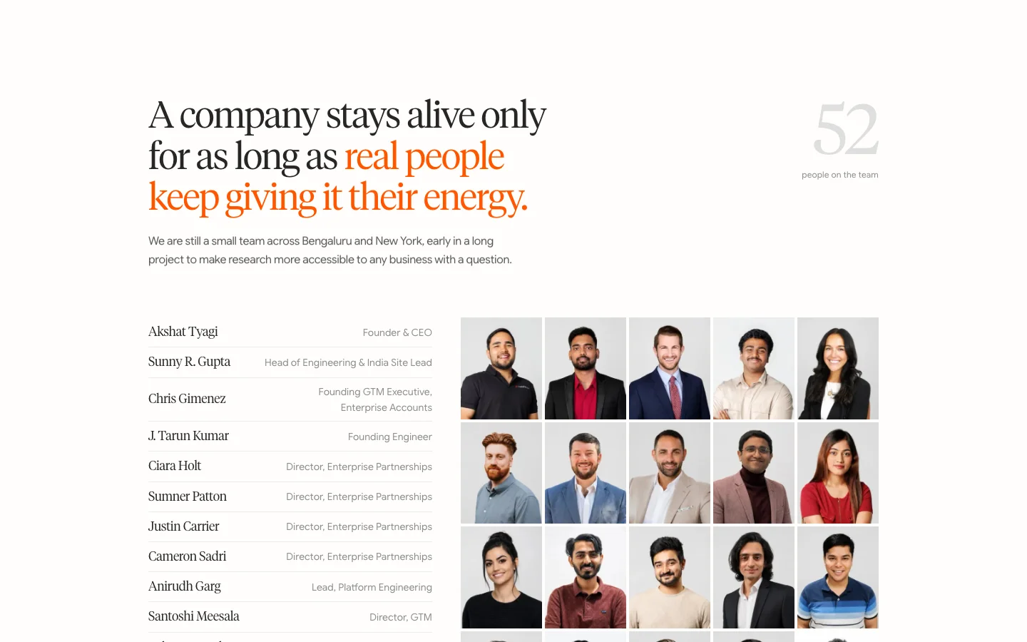
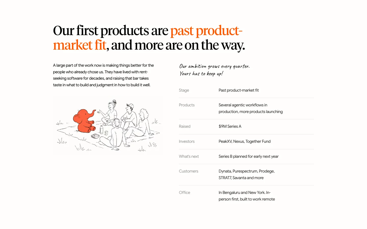
Designed as a prospectus rather than a brochure: the mission up front, then the company's stage laid out plainly, with terracotta marking what matters.
[Blog]
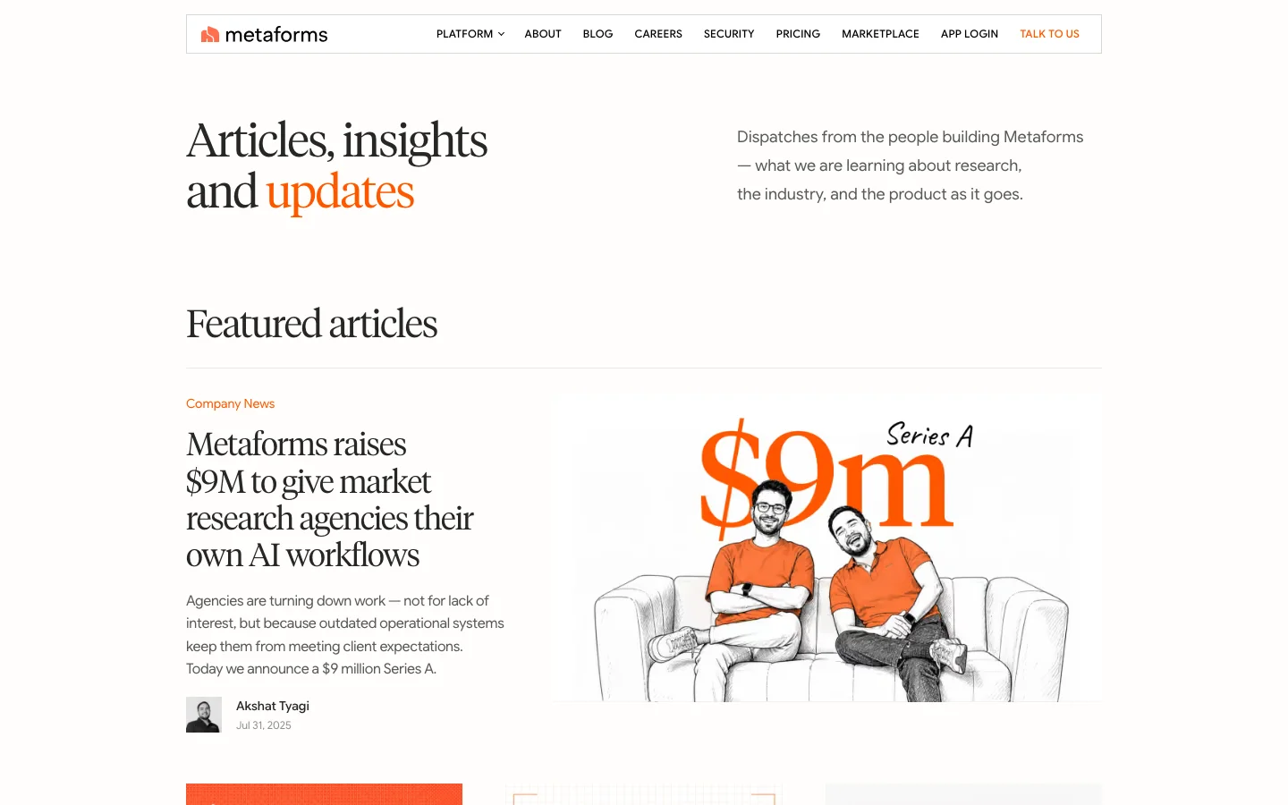
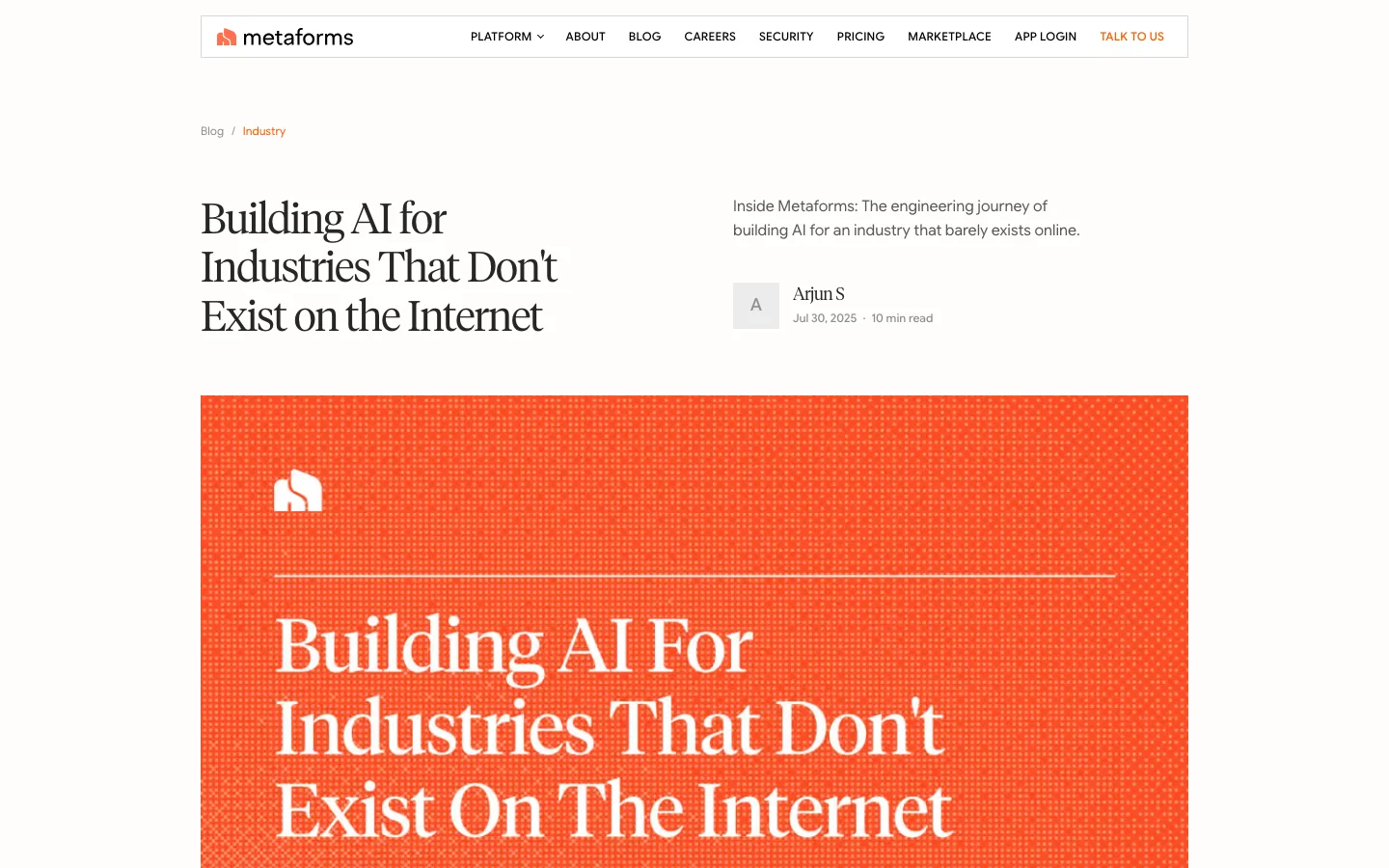
A text-dense layout: one featured image and a plain article list. For a research audience, the headlines are the draw.
[Outcome]
A brand, its guidelines, and a full site in one voice. I also helped on the product pages.
From
A strong point of view with no visual language
To
An editorial system that reads like Metaforms on every page