Supermemory · Design system
A shared vocabulary for the system
Color
brand
neutral
success
error
Typography
display 2xl
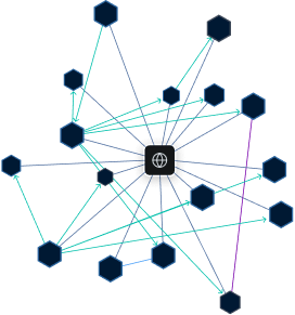
The memory layer
display lg
Built for AI agents
display sm
Connect your tools and remember everything
text lg
Persistent memory across every session and surface.
text md
Six display sizes, five text sizes — sized on a modular scale.
text xs
Caption · Metadata · Timestamps
Spacing scale
none
0
xxs
2
xs
4
sm
6
md
8
lg
12
xl
16
2xl
20
3xl
24
4xl
32
5xl
40
6xl
48
7xl
64
8xl
80
9xl
96
10xl
128
11xl
160
Components
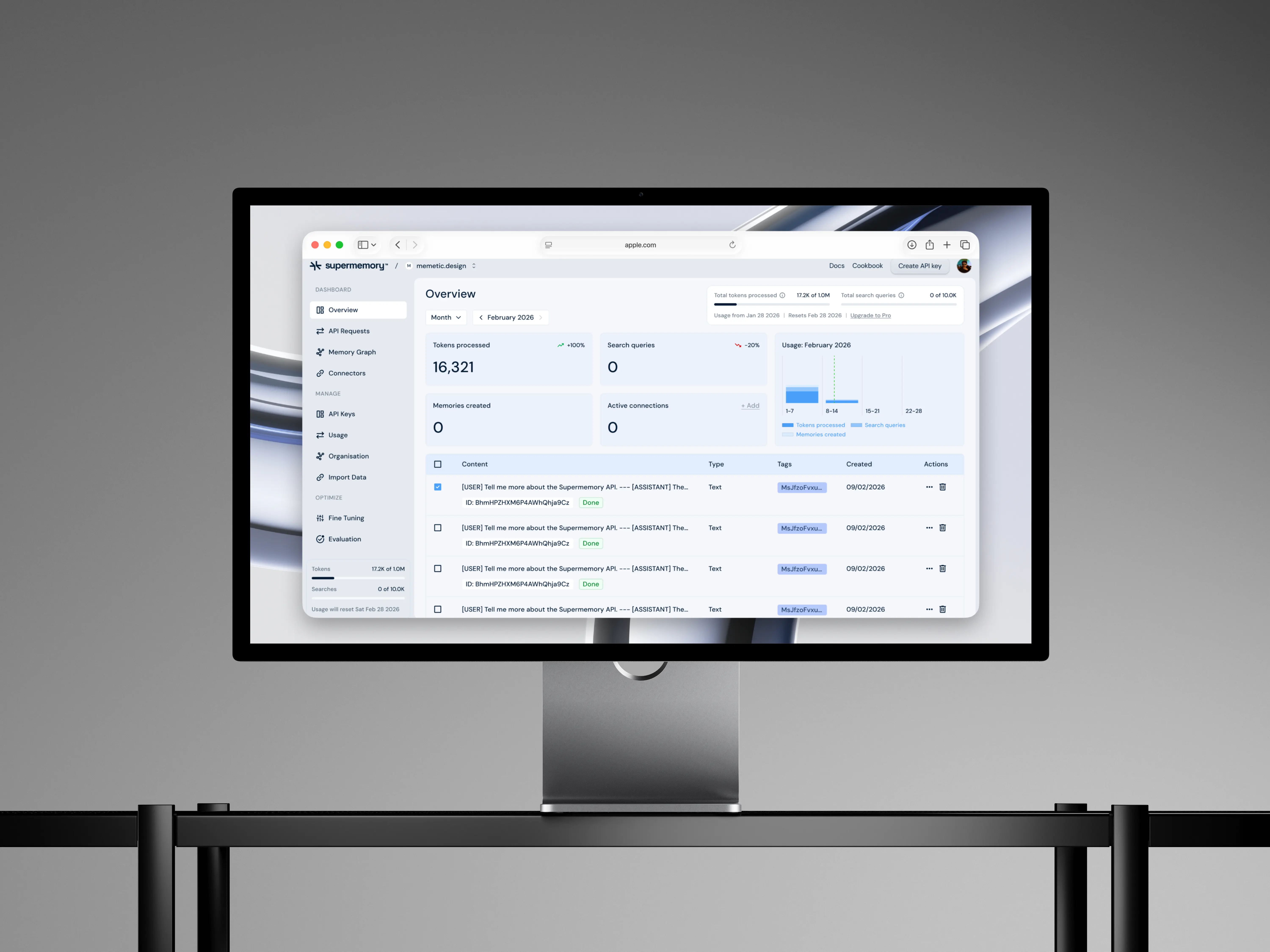
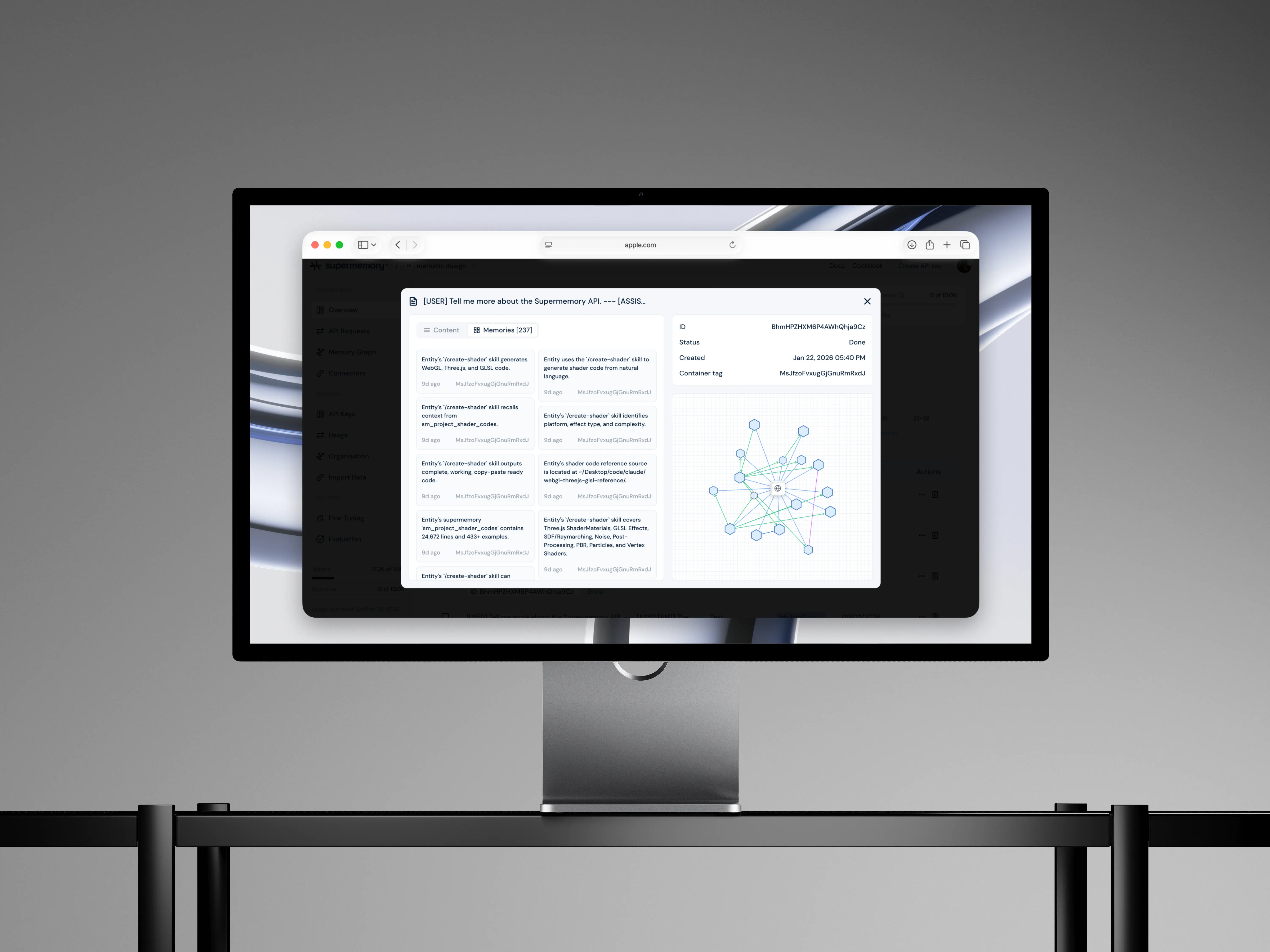
Search memories...
apistrategy