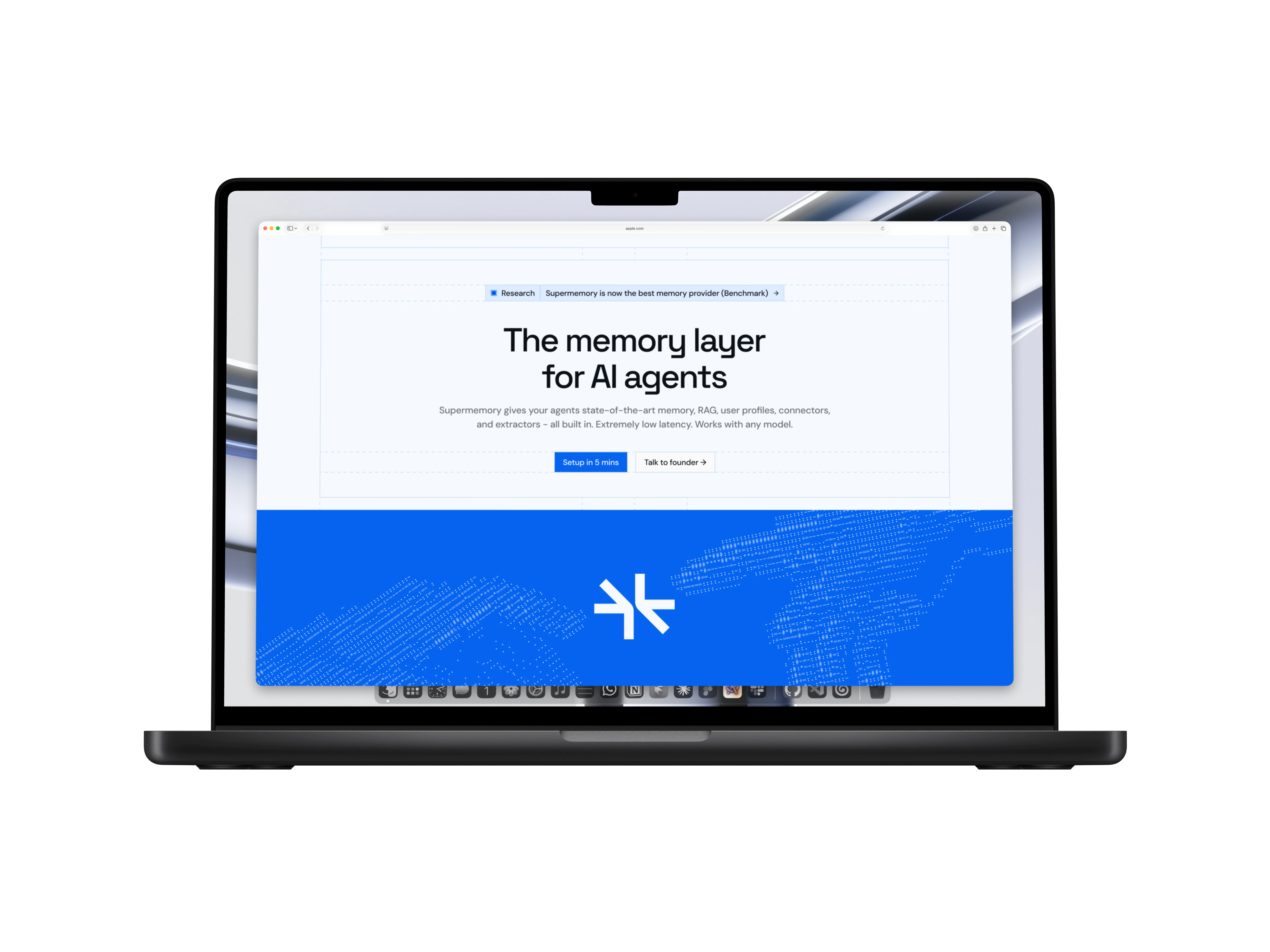
[Context]
Supermemory operates across multiple surfaces and audiences: enterprise developers building with the API, prosumers connecting their tools, and consumers using Nova, their embedded agent experience.
The website had grown to cover all of this, but the pages weren't working together. Each audience had a different need, and the design wasn't giving them a clear path in.
[The challenge]
The challenge wasn't one problem. It was several layered together. The homepage had to convert developers while also signposting prosumers. The plugins page had to explain a new memory paradigm for AI tools. Nova needed its own visual identity as a consumer experience. The research page had to establish technical credibility. The about page had to communicate conviction. Underneath all of it, the lack of a shared visual foundation meant each page had grown slightly inconsistent, and the design system was meant to fix that.
[Homepage]
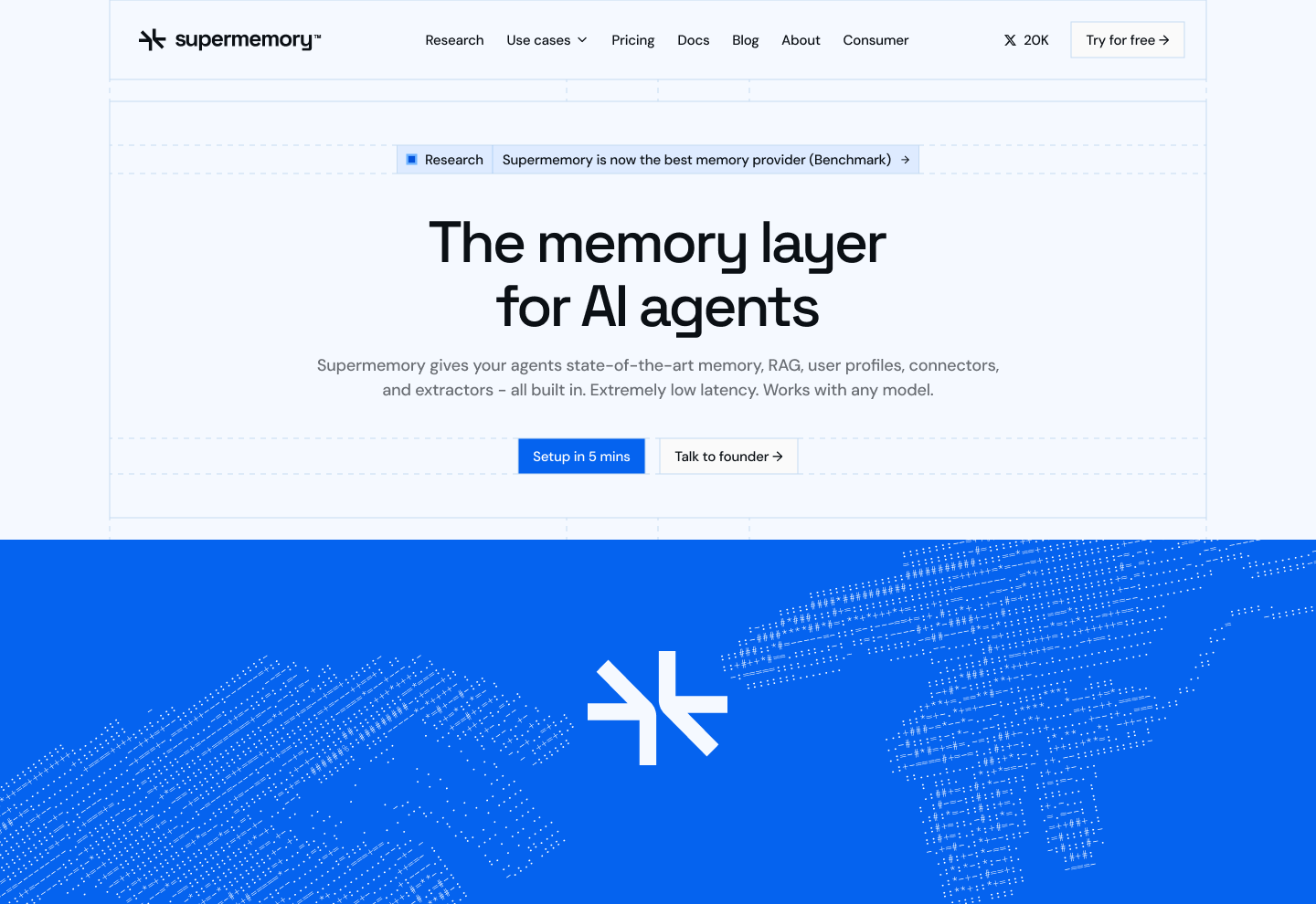
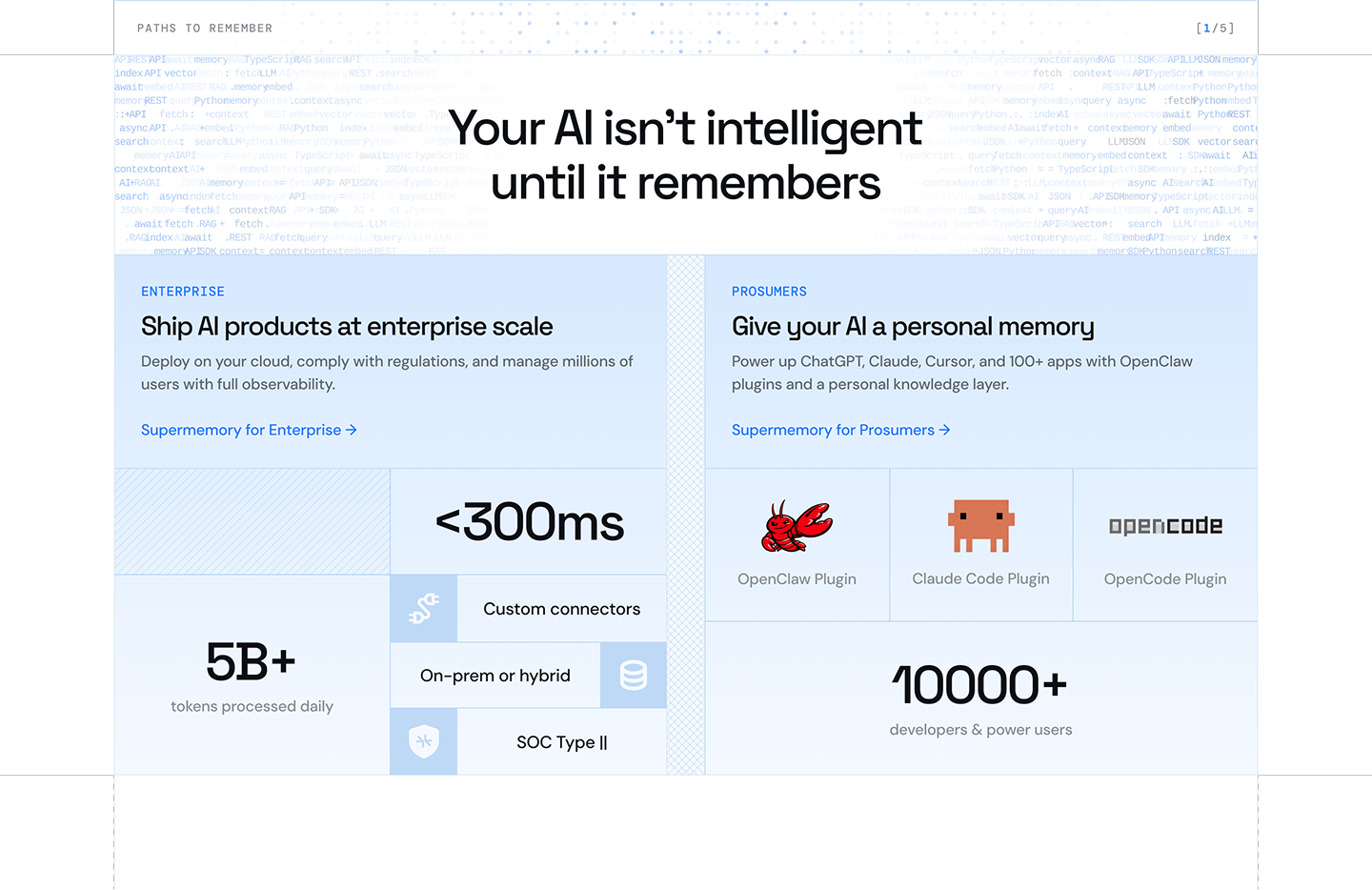
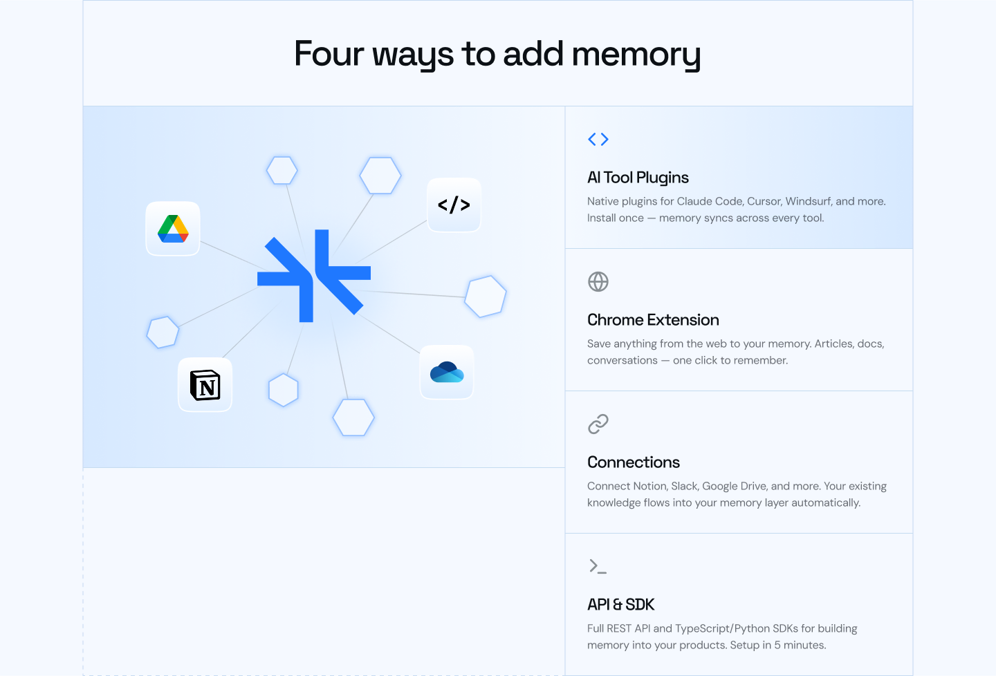
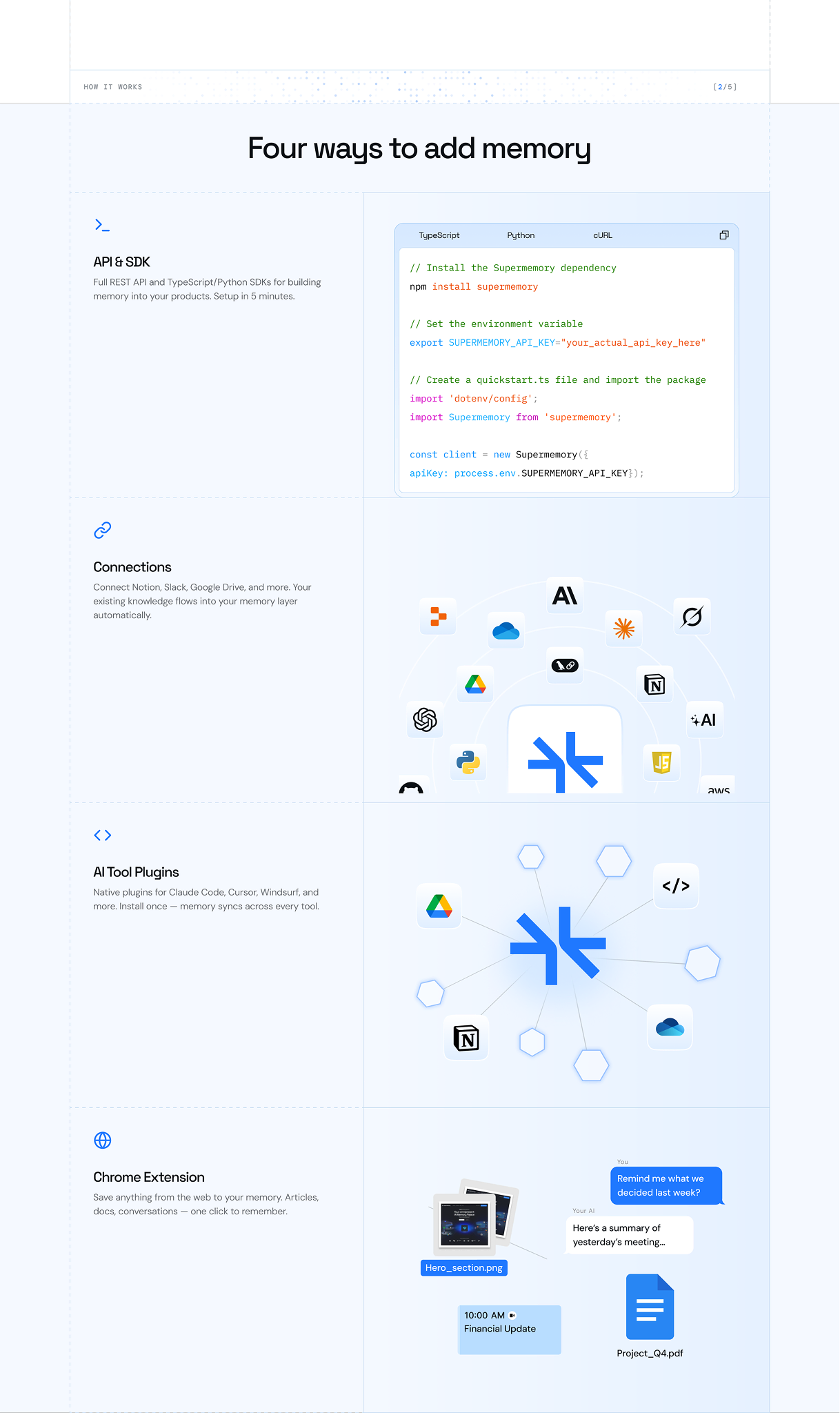
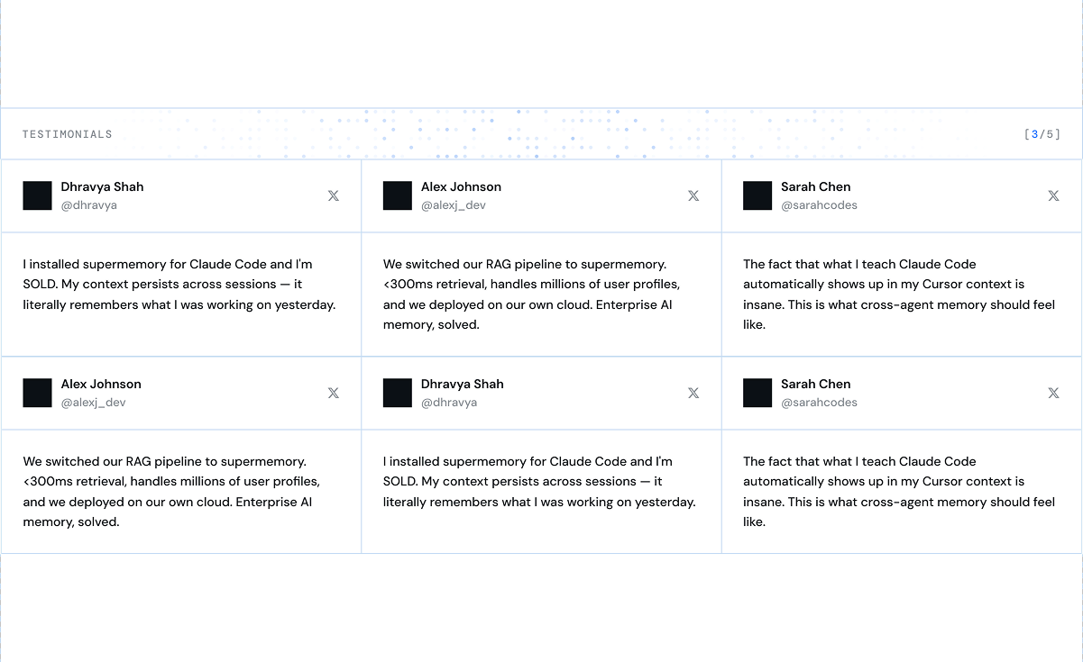
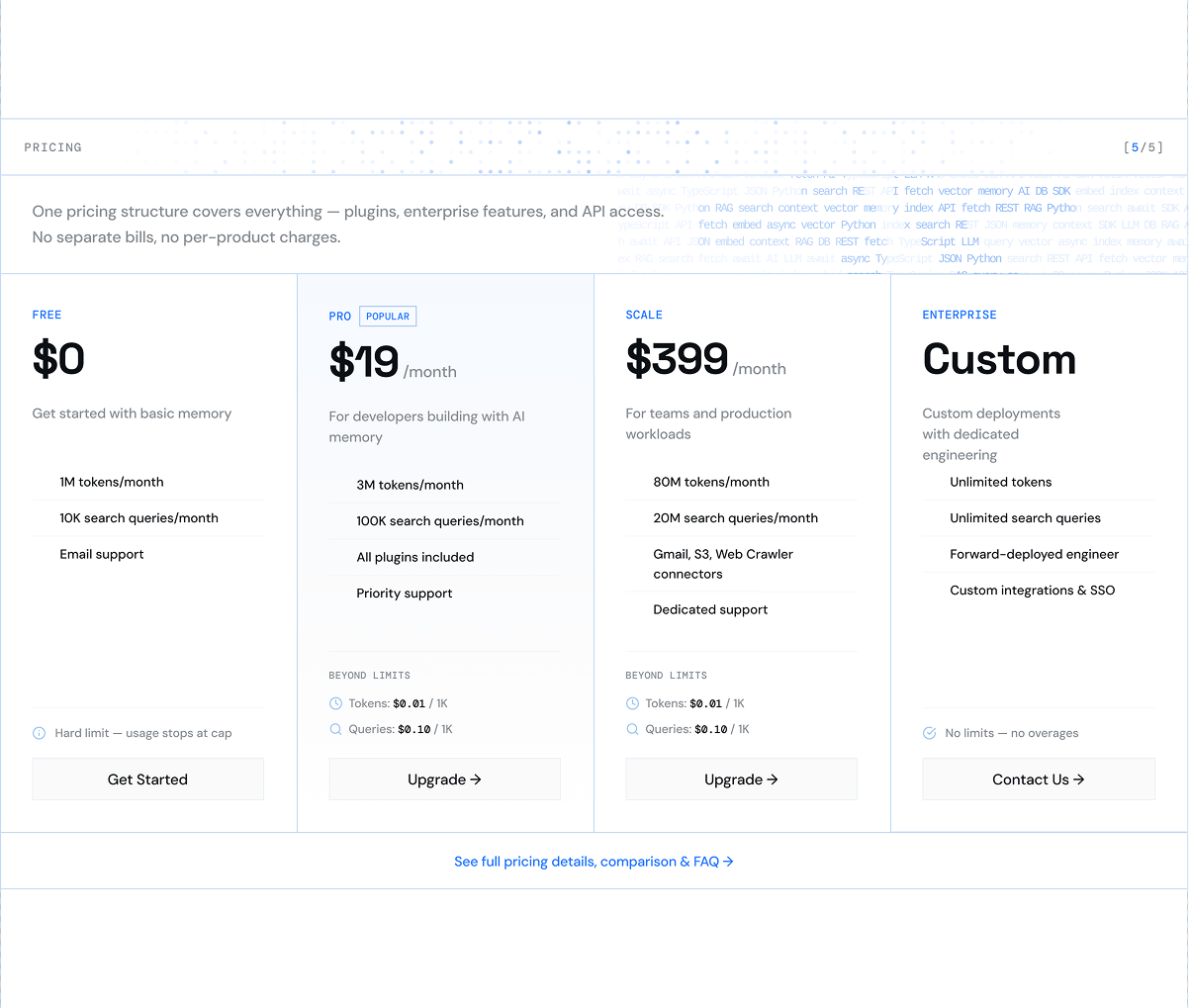
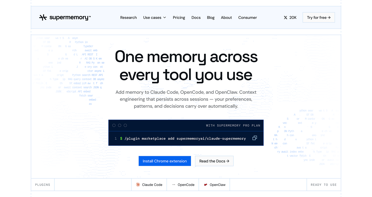
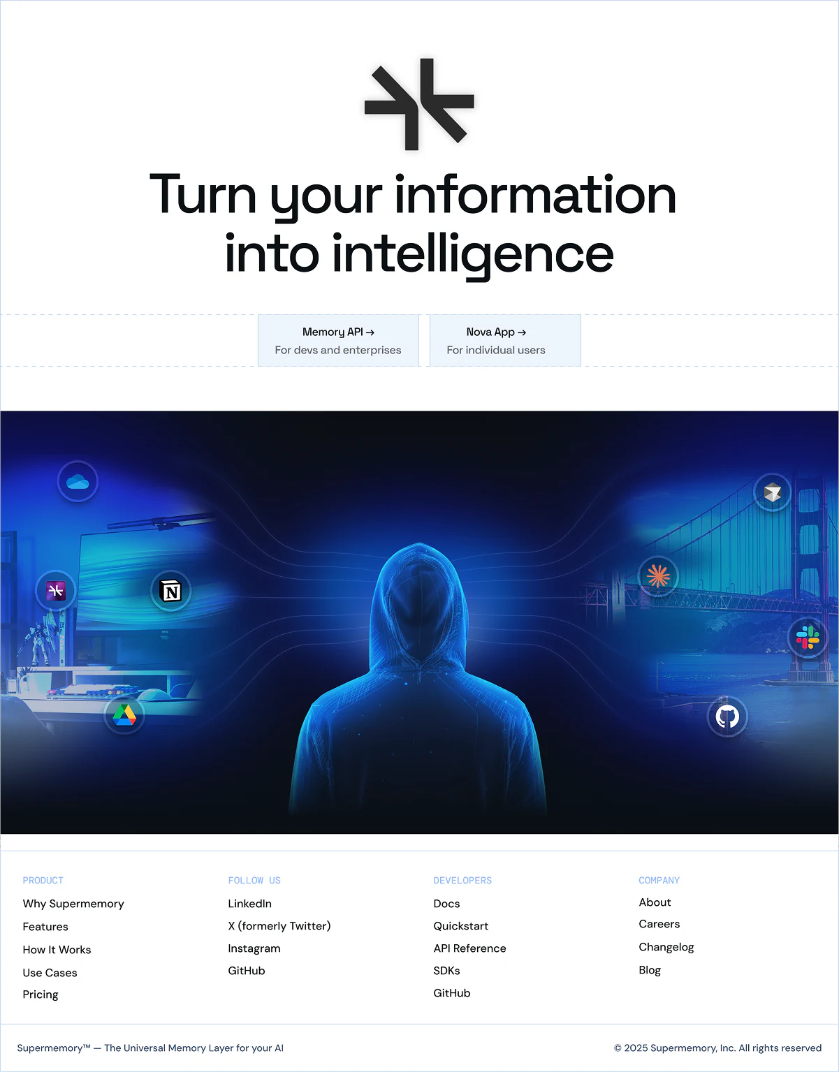
The homepage leads with the developer audience: the memory layer for AI agents. I sharpened the headline, simplified the layout, and reorganized the sections to move from value proposition through integration paths to social proof. The goal was to convert, not just introduce.
Below the hero, the page splits: enterprise left, prosumers right. Each path reads cleanly on its own without the page feeling like two different products.
[Plugins page]
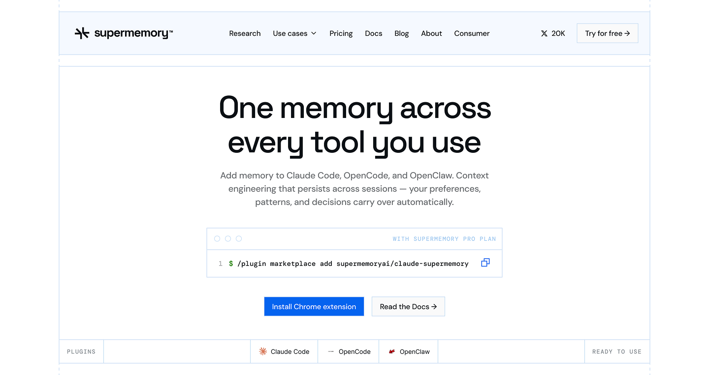
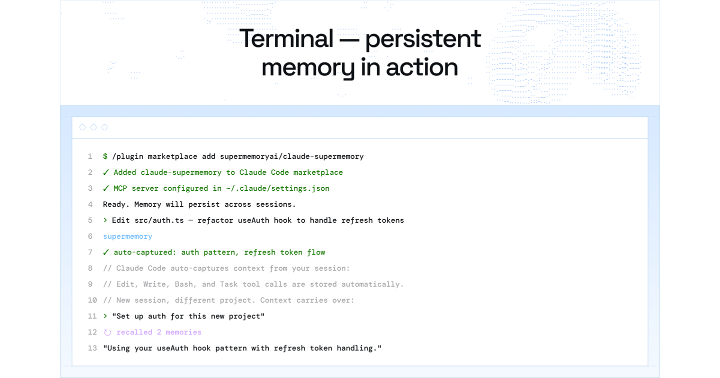
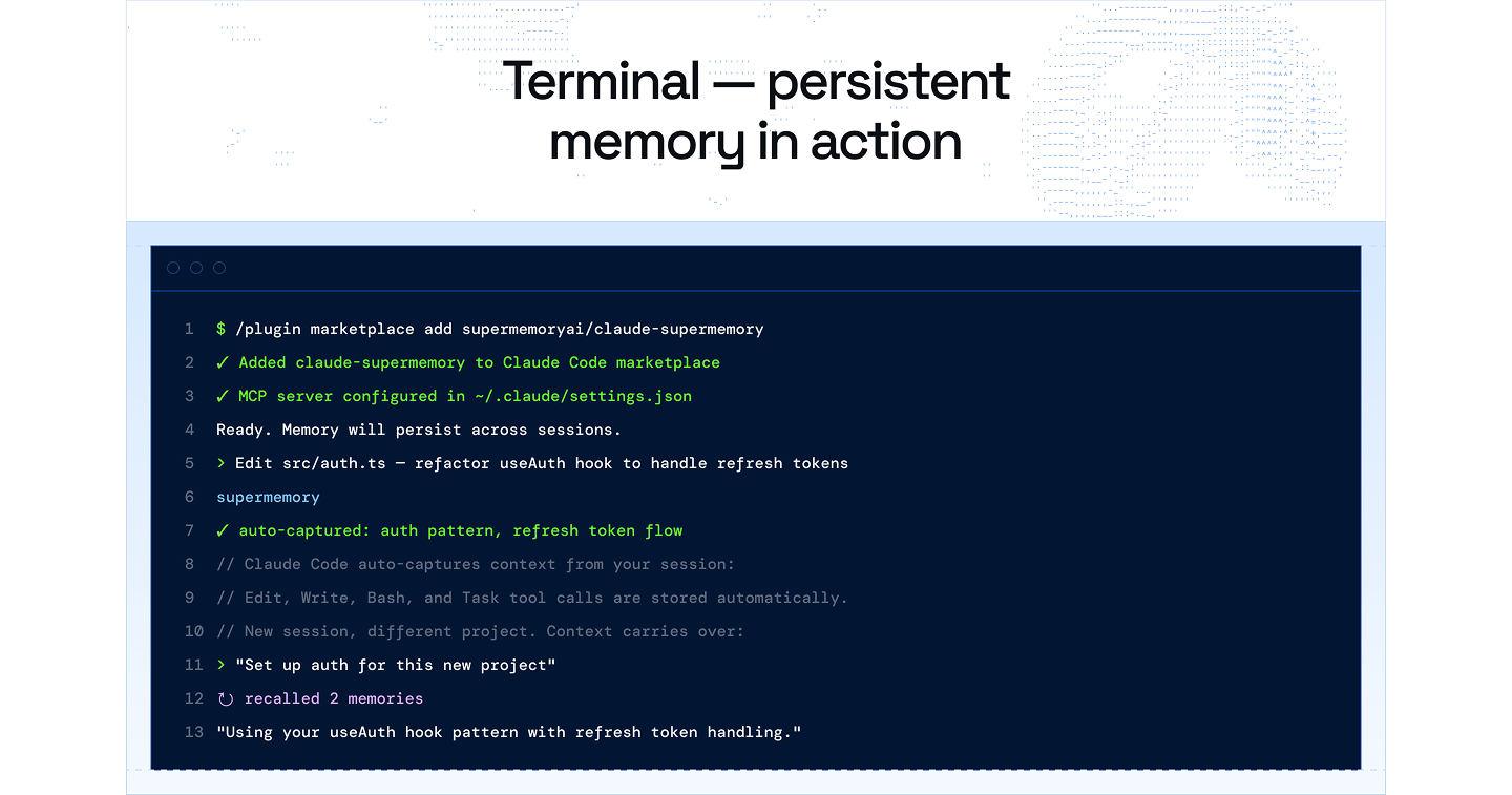
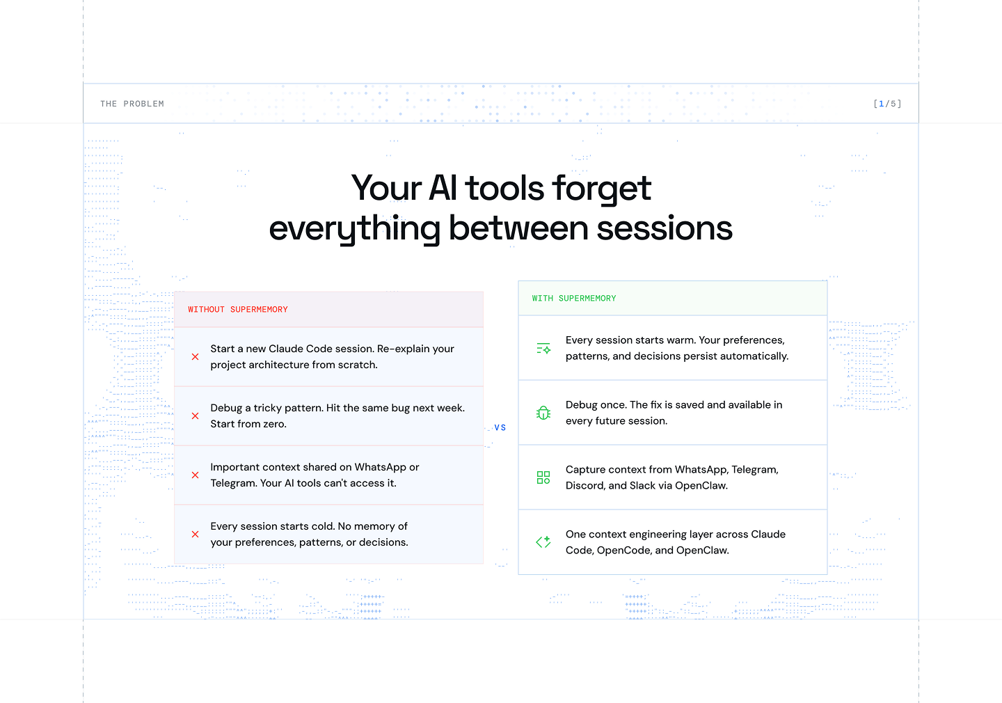
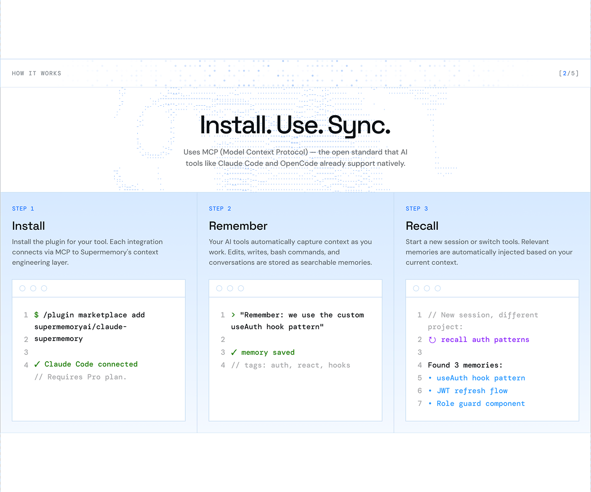
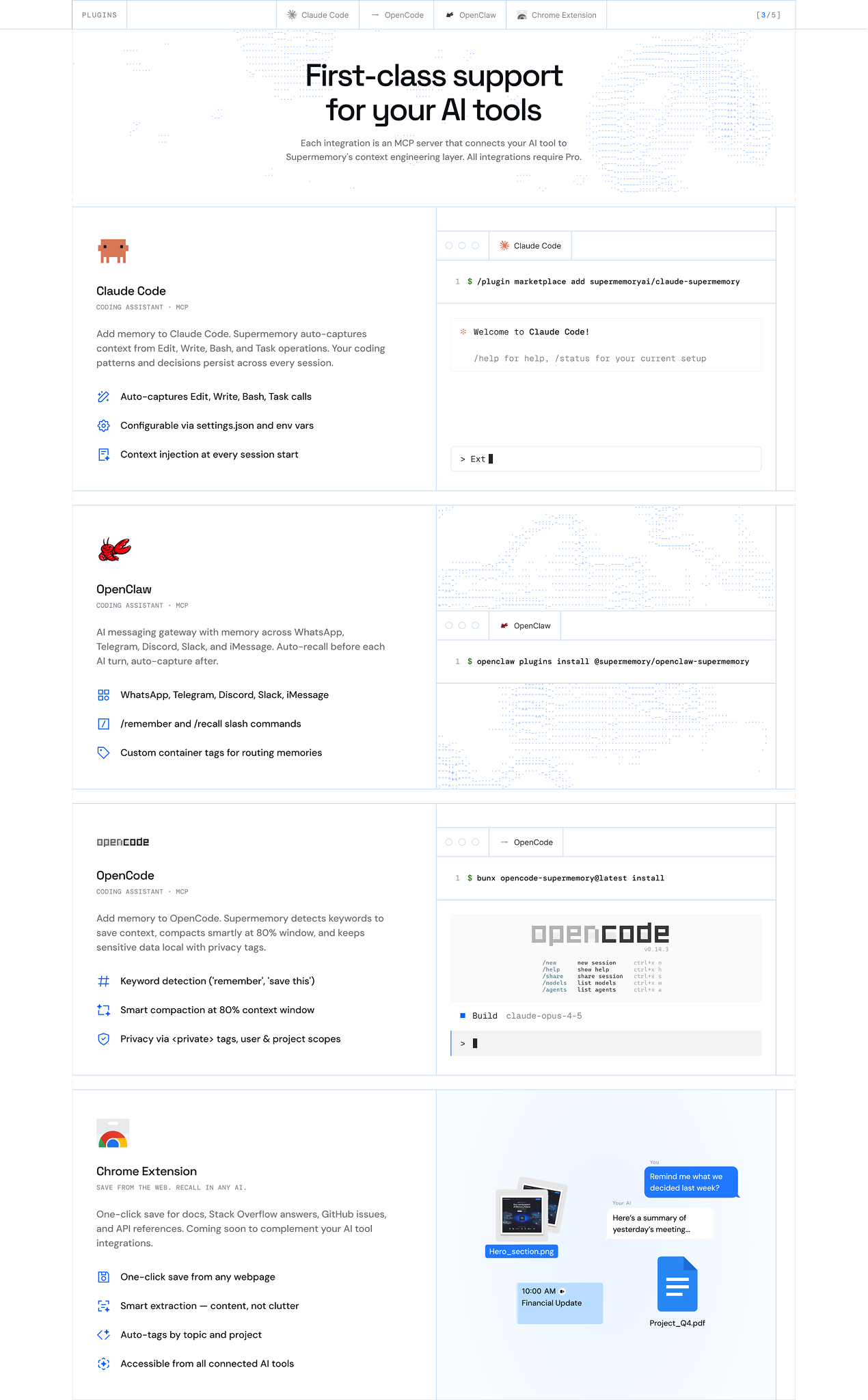
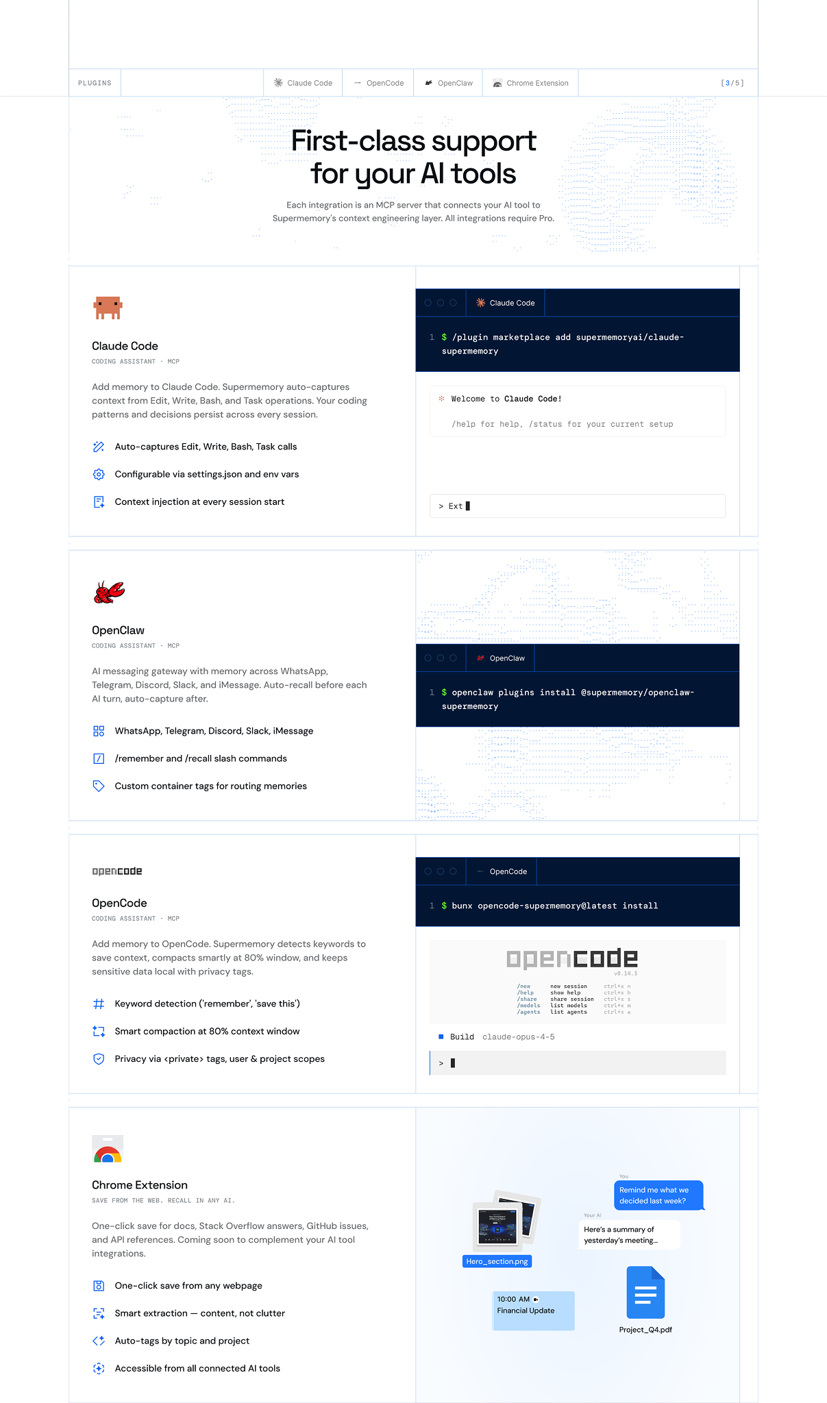
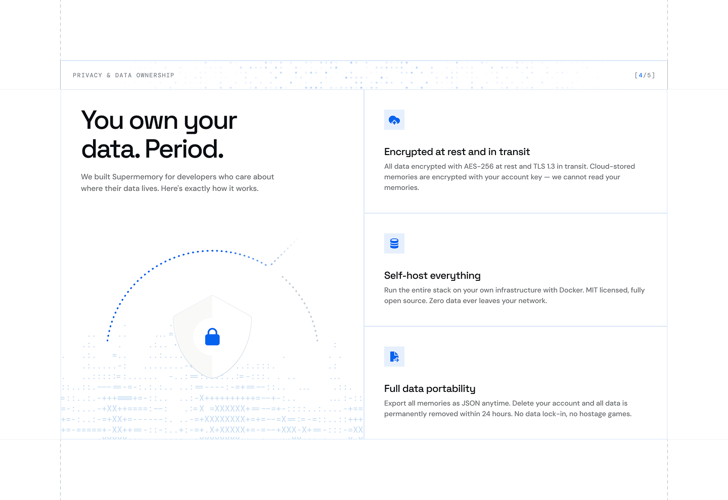
The plugins page had a specific job: explain the core pain (AI tools that forget everything between sessions) and show how Supermemory fixes it across Claude Code, OpenCode, OpenClaw, and Chrome.
I built the page around the before/after contrast, leading with the problem so the solution landed harder.
[Nova]
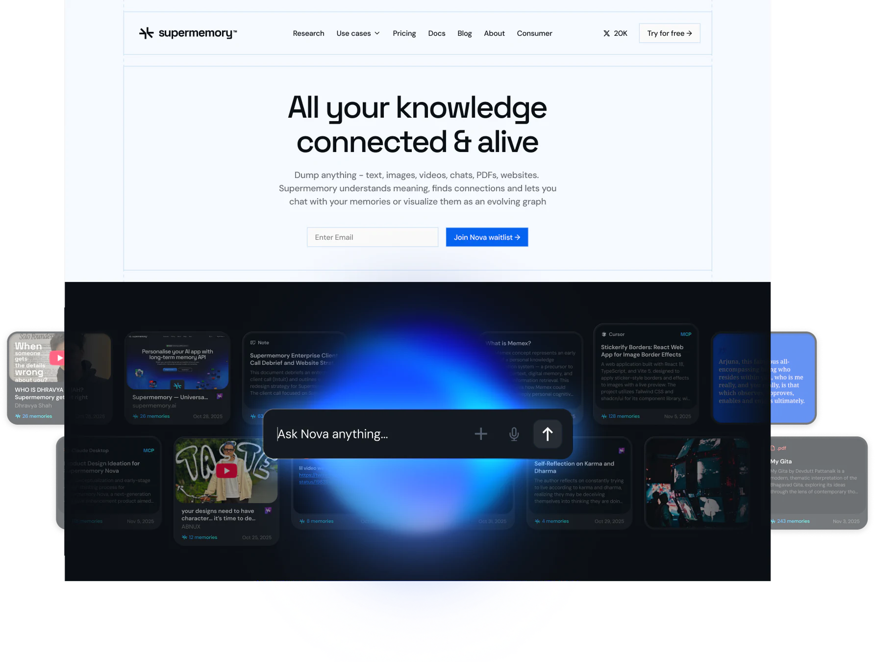
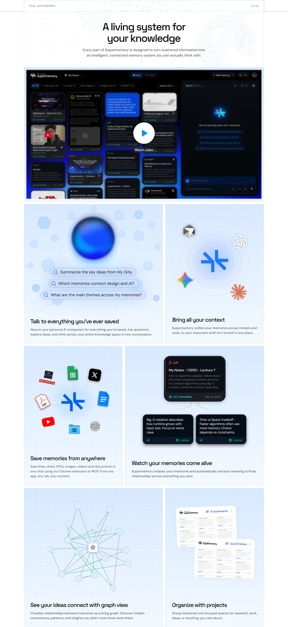
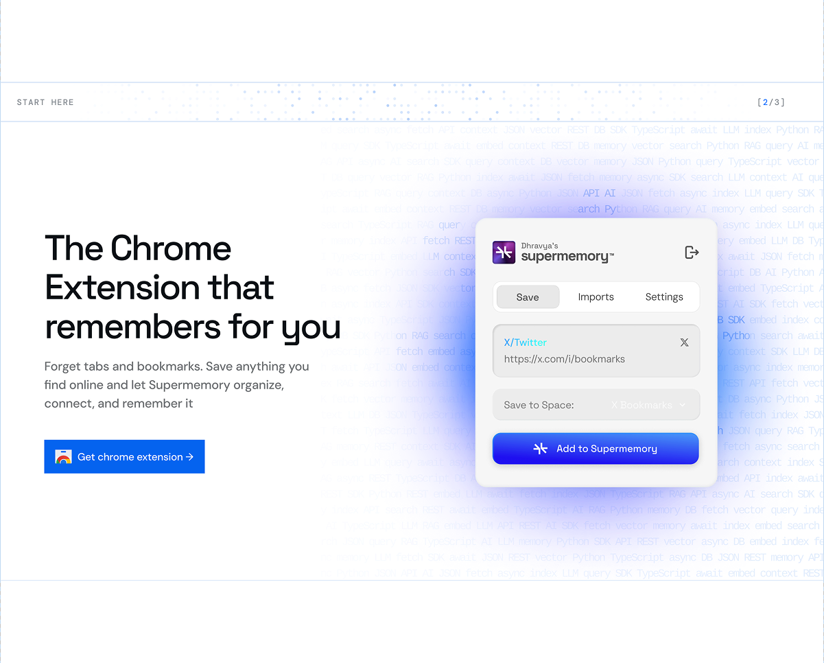
Nova is the consumer side of Supermemory: personal, experiential, less technical. I designed the page around the feel of interacting with your own saved knowledge.
[About]
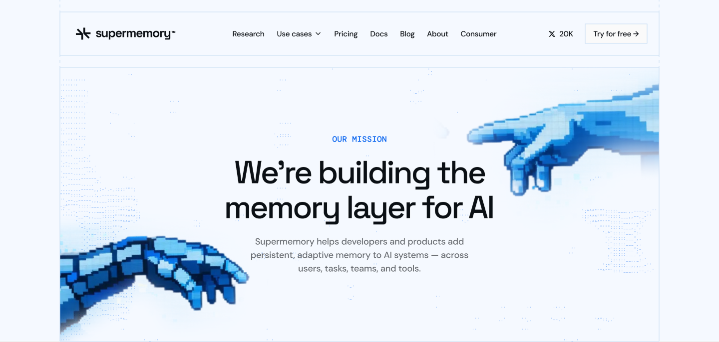
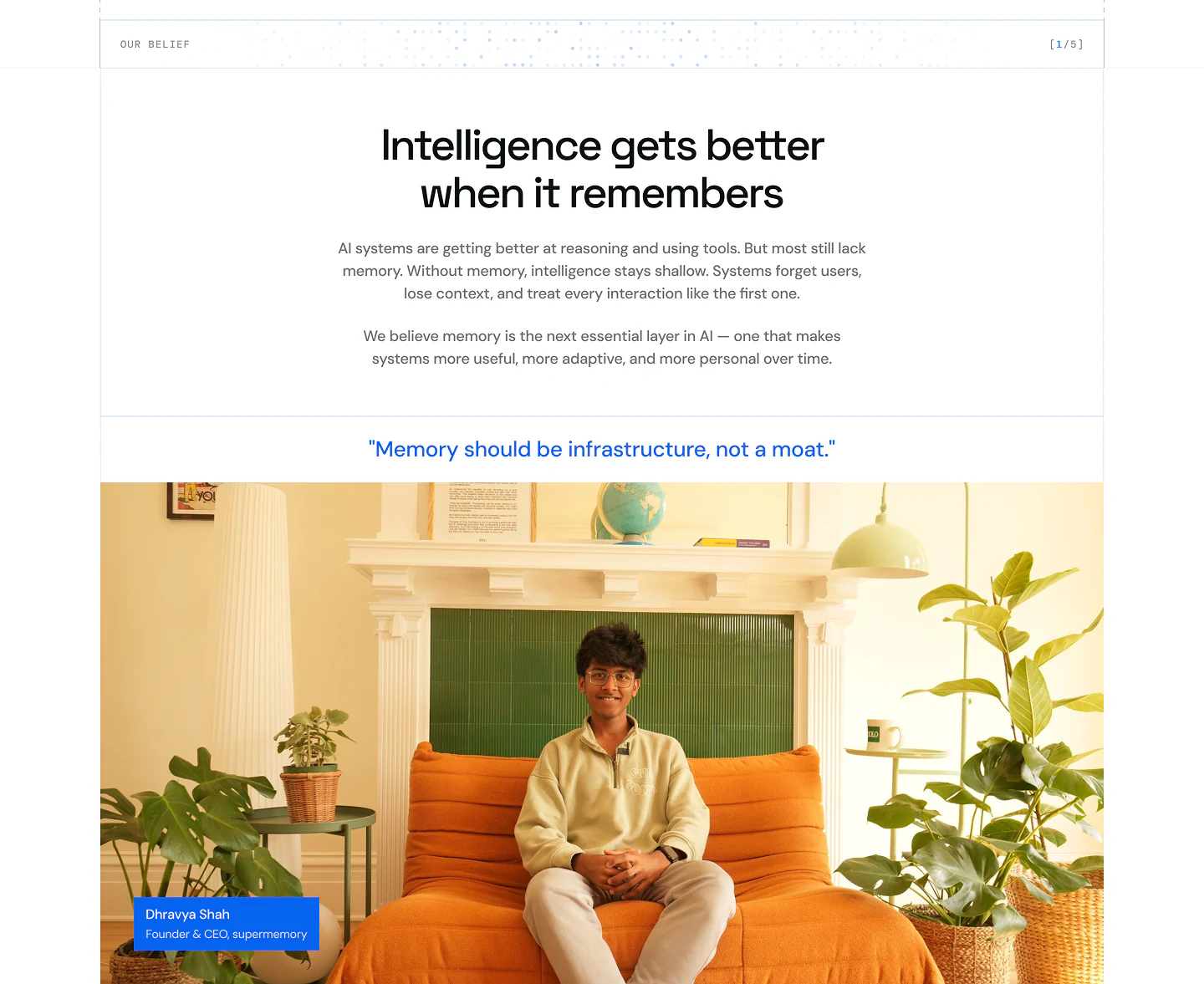
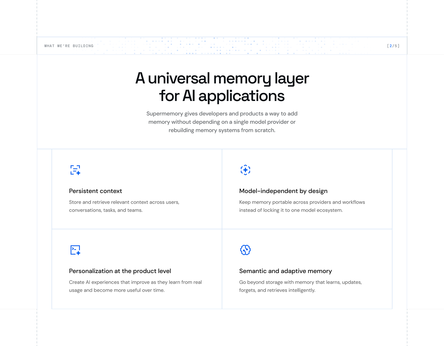
More manifesto than company overview, built to communicate mission, introduce the team, and show investor backing without feeling corporate.
[Outcome]
Five pages, each with a clear job.
From
Separate pages, different visual languages
To
One product family, coherent across every audience