[Context]
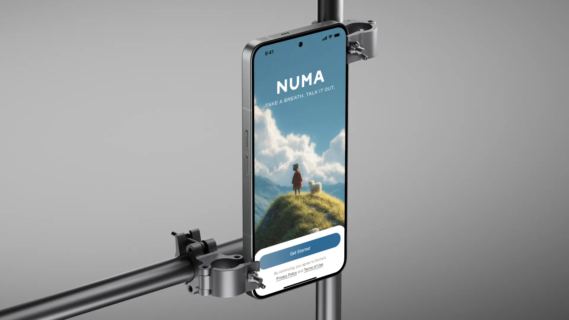
A lot of people want to talk about how they feel but don't always have someone to talk to. The apps that exist for this (therapy chatbots, mood trackers, journaling tools) tend to feel either too clinical or too robotic. I wanted to design something that felt gentle, human, and emotionally safe. The moment you open Numa should feel like exhaling.
[Research]
Since this was a hypothetical brief with no real users, I did synthetic research, using ChatGPT to simulate user needs and pain points, combined with a competitor study of five products: Dot, Stoic, Pi, Ash, and ChatGPT itself. Most AI companion apps either lean too hard into productivity (mood logs, streaks, data) or feel like a chatbot wearing a therapist costume. None of them made opening the app feel like a relief.
[Visual Direction]
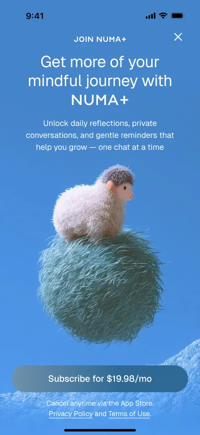
I wanted Numa to feel like a soft, safe place, not a medical app and not a generic chat interface. The direction I landed on was soft, felt-inspired visuals with a palette of natural greens, blues, and terracotta.
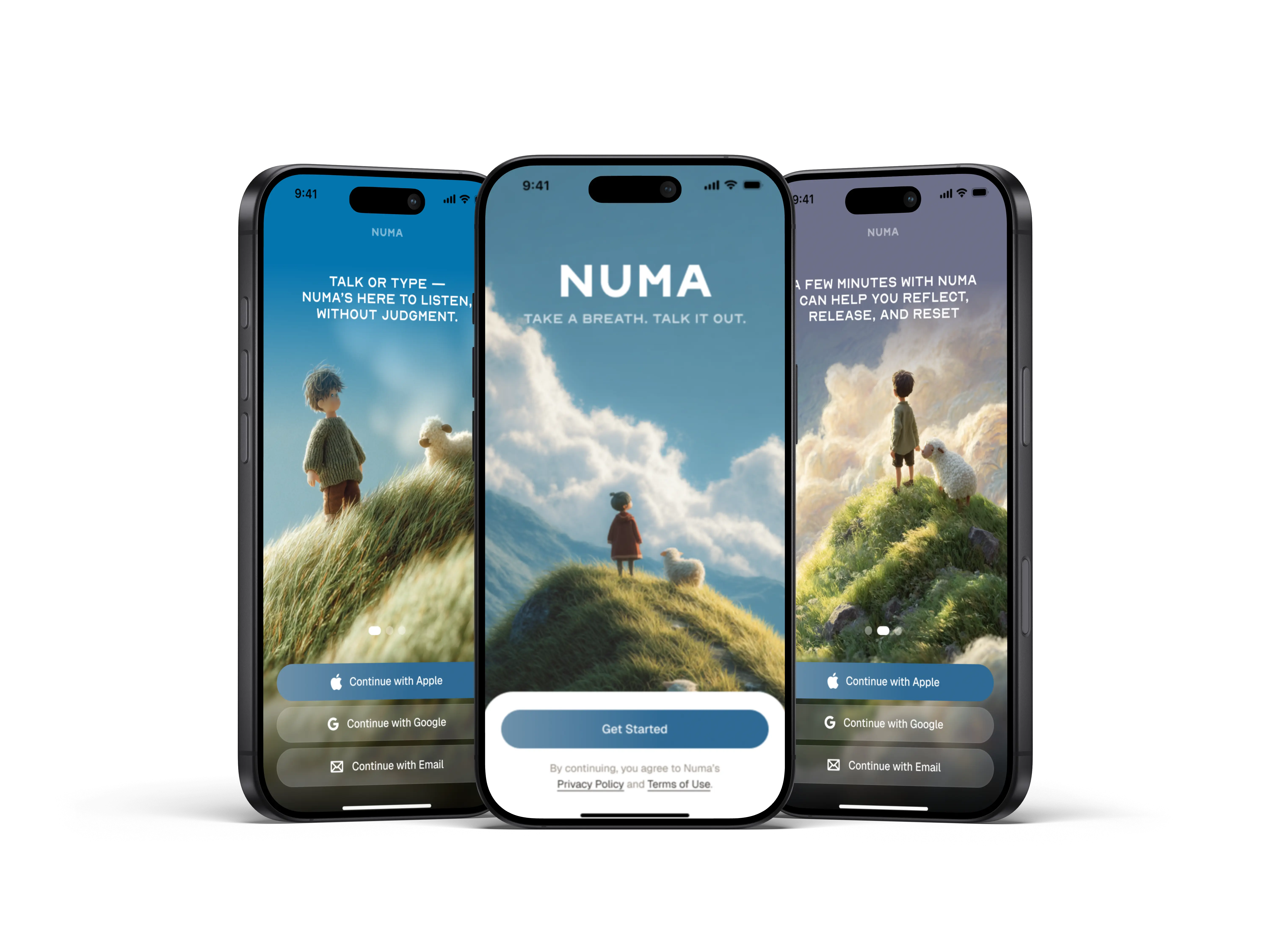
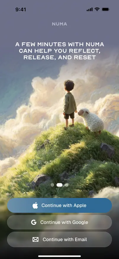
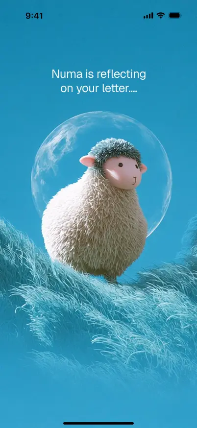
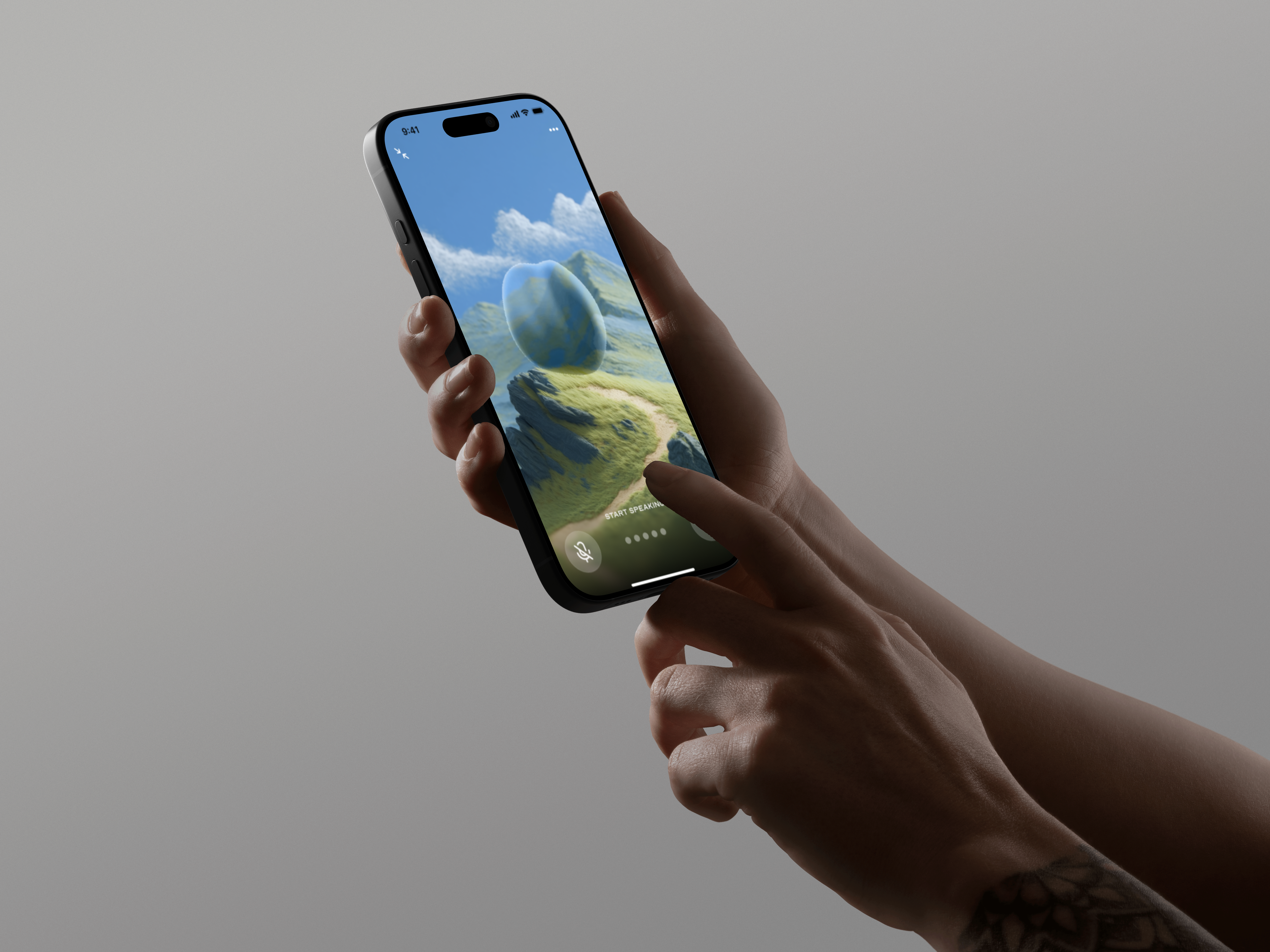
I used Midjourney to generate a small felt figure in nature scenes: a quiet presence that shows up across onboarding, conversations, and voice mode. Not a mascot; something that makes the app feel inhabited without being performative.
[Onboarding & The Letter]
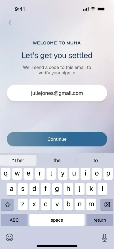
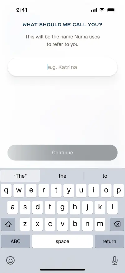
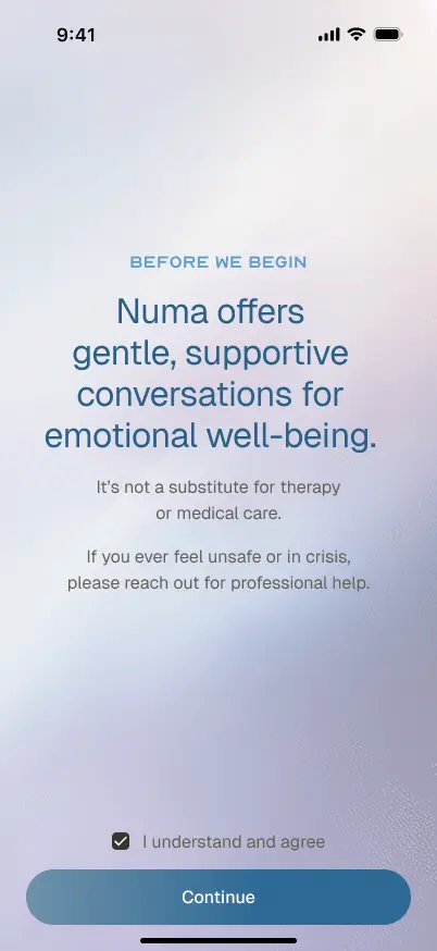
Onboarding introduces Numa through the character in different natural environments. The tone is calm, not instructional. Sign-in uses Apple/Google, and the setup flow asks your name, email, and what brings you to Numa.
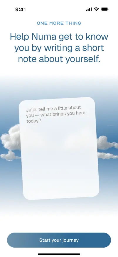
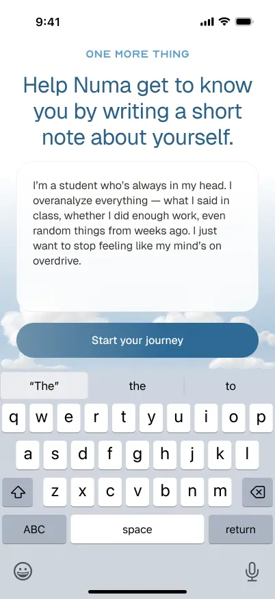
Before your first session, Numa asks you to write a short note about yourself. Not a questionnaire, a letter. This reframes the entire relationship from the start: you're not being assessed, you're introducing yourself.
[Chat]
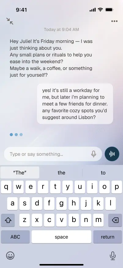
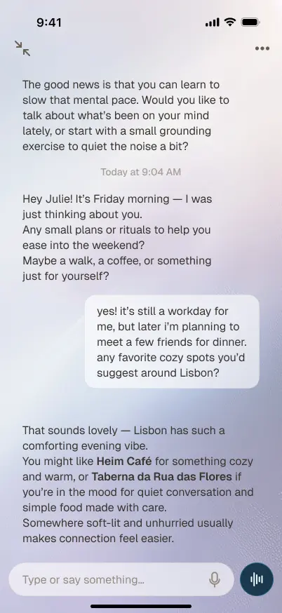
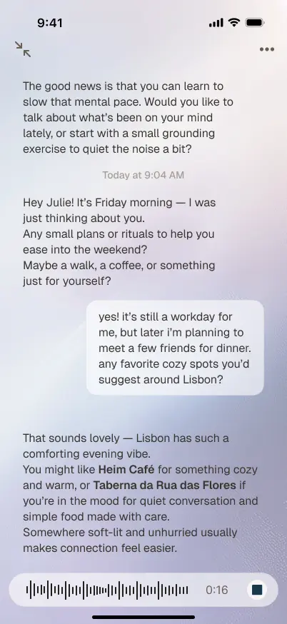
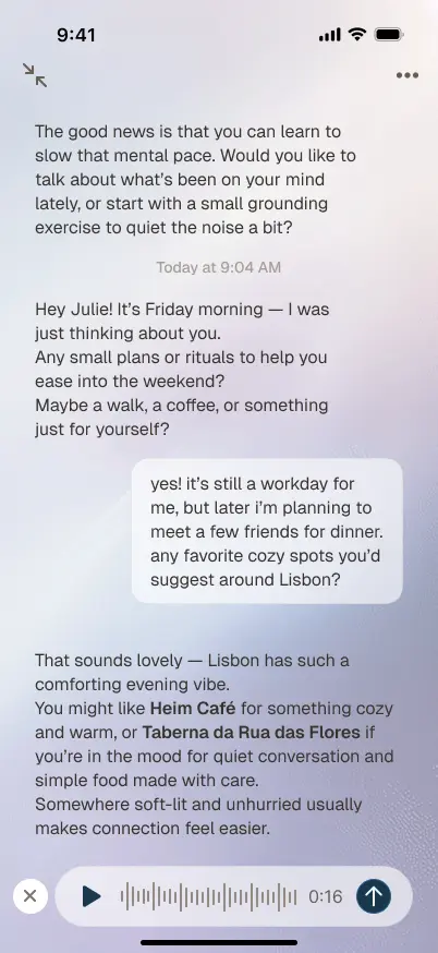
The chat experience is built around long-form text conversations on calm gradient backgrounds, with the felt character appearing naturally in the flow. The UI avoids the typical chatbot bubble pattern: no timestamps on every message, no read receipts, no typing indicators. It's designed to feel more like reading and writing than messaging.
[Voice Mode]
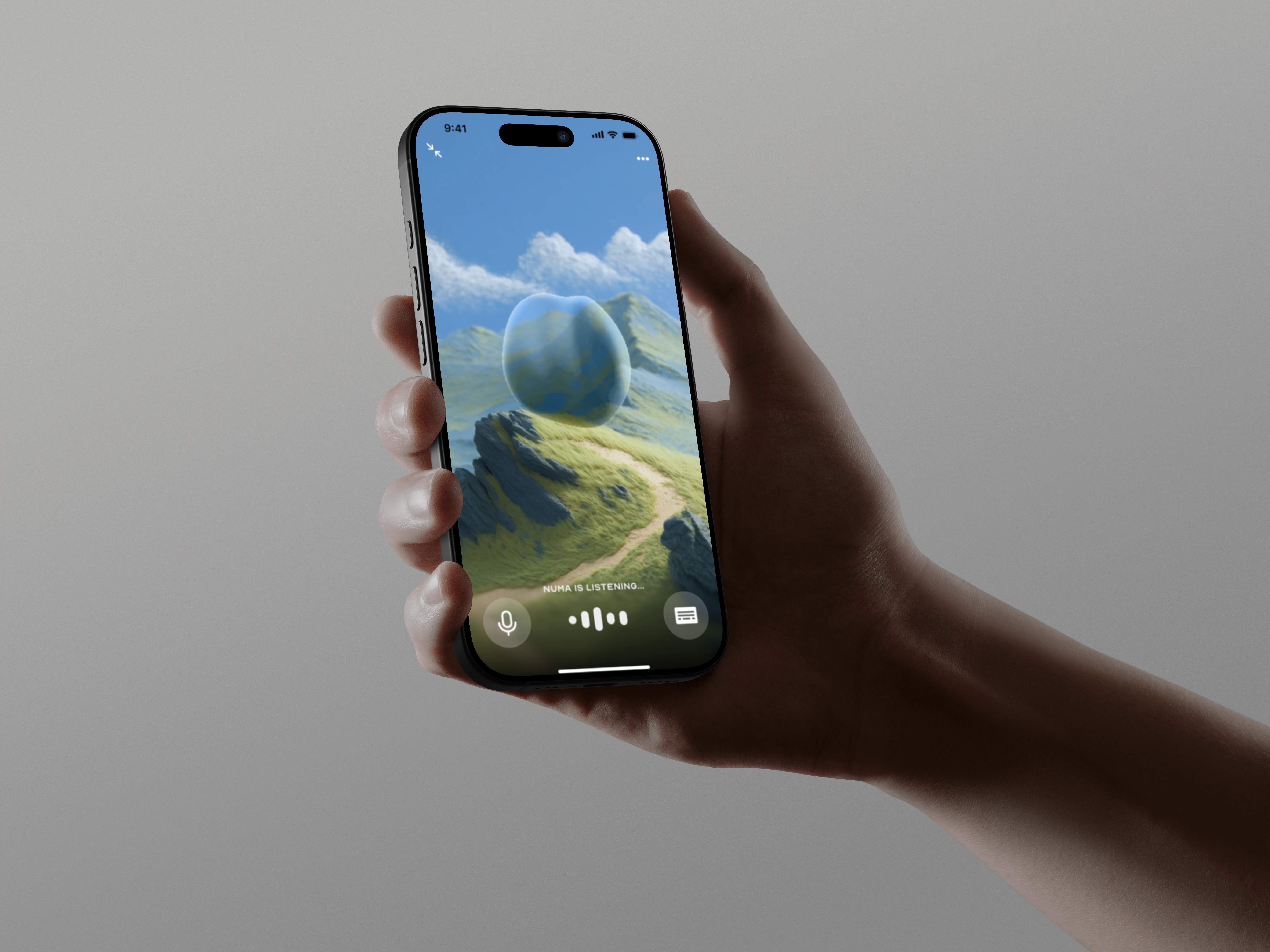
Voice mode was added beyond what the brief asked for. The screen strips away almost everything, leaving just the character against a sky, with a simple waveform and controls. Voice mode should feel like sitting with someone, not operating an interface.
[Design Decisions]
Felt character over abstract UI: The felt figure gives Numa a personality without making it feel cartoonish. Warm without being childish.
The letter instead of a questionnaire: Most mental health app onboarding is a checklist, which immediately frames the experience as clinical. A letter reframes it as personal.
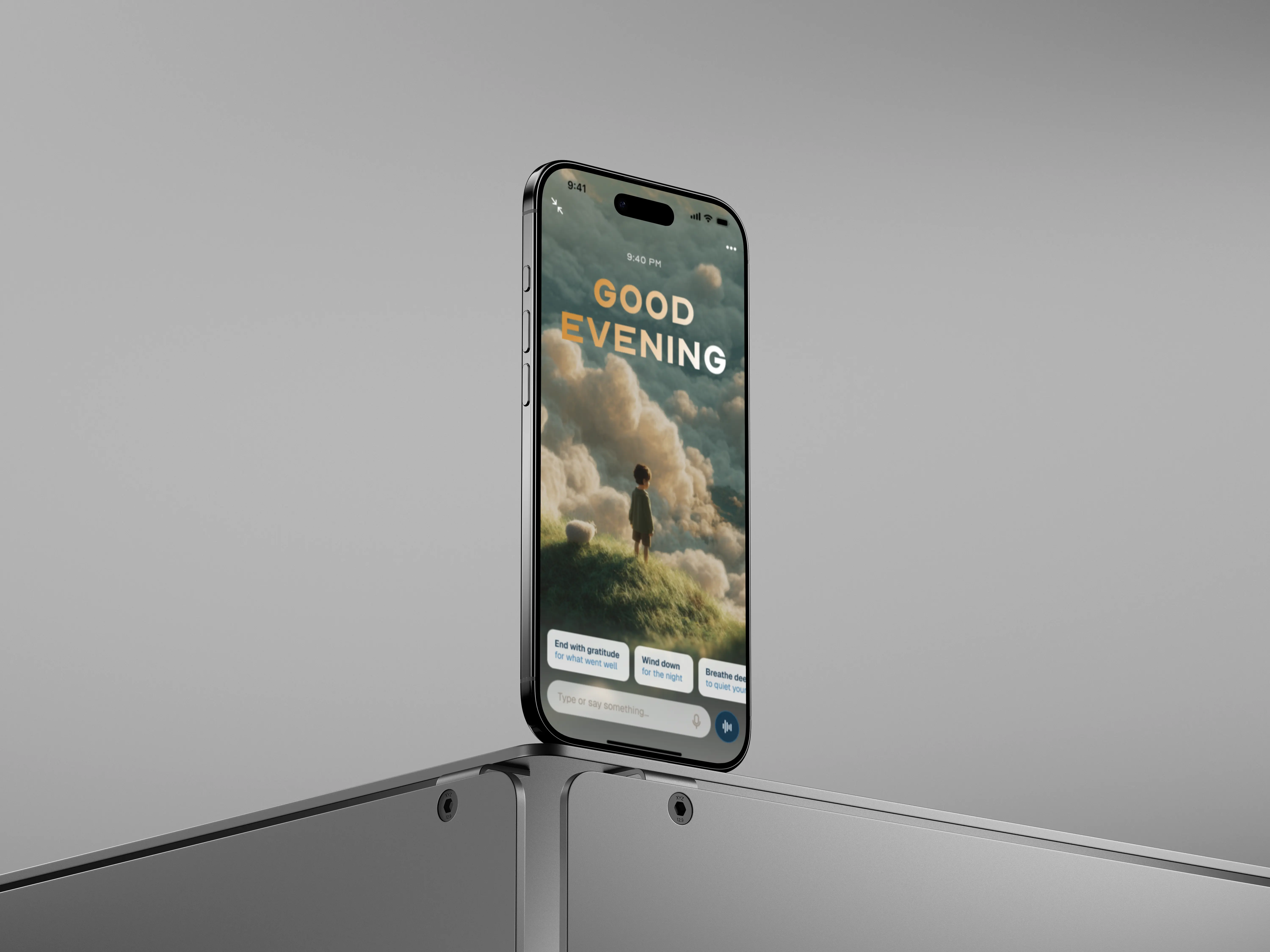
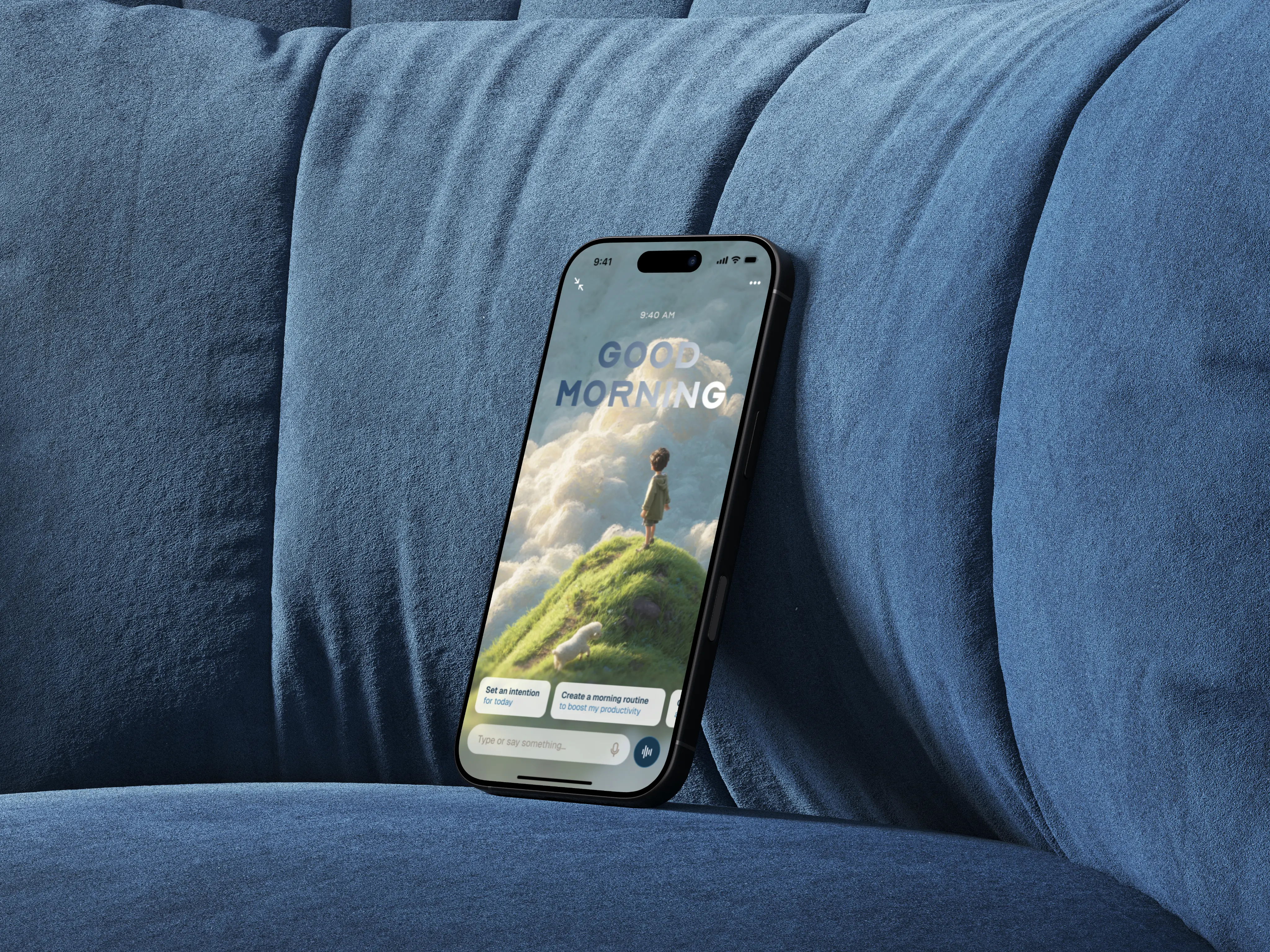
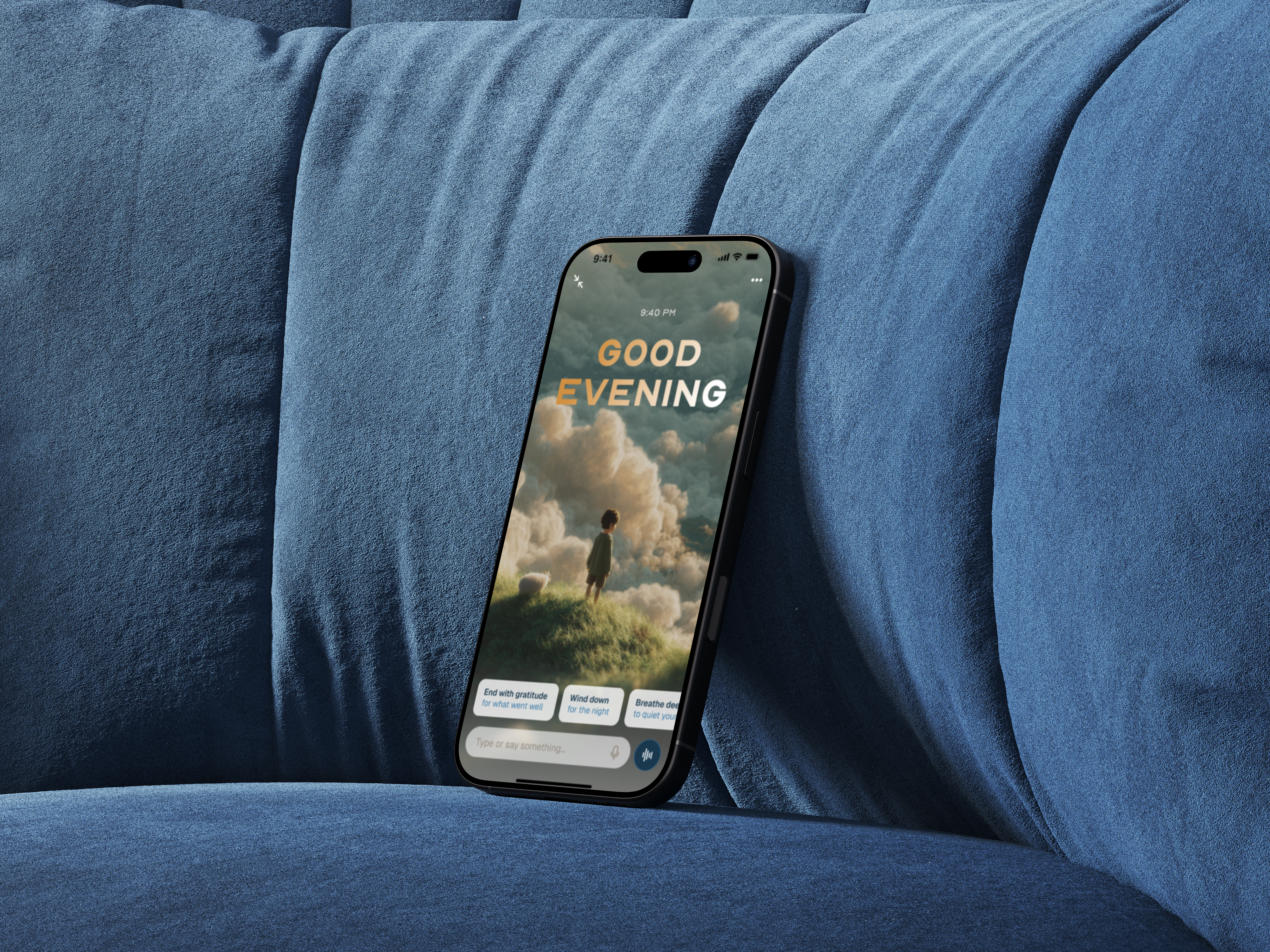
Time-aware home screen: The app greets you differently based on when you open it, with different lighting and prompt suggestions. It makes the app feel aware of you.
Nature over neutrality: The backgrounds are skies, hills, grass. The app feels like a place you go to, not a tool you use.
[Iteration]
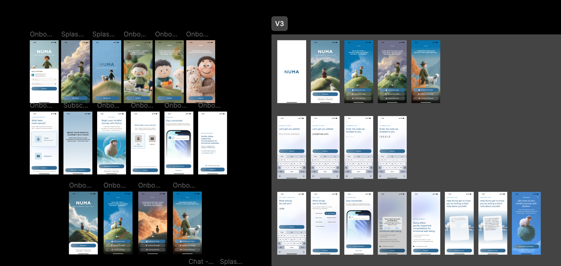
The final designs went through multiple rounds before landing on V3. Earlier versions explored different onboarding structures, home screen layouts, and conversation UI patterns: button-based emotion check-ins, more structured journaling prompts, tighter chat layouts. What changed across iterations was mostly stripping things back: V3 simplified the home screen to a greeting with one clear path forward, dropped most of the chat chrome, and let the onboarding just get out of the way.
The character scenes also evolved. Earlier versions had more varied Midjourney outputs with different styles and compositions. By V3 they were consistent: same soft lighting, same grounded palette, same quiet tone across every screen.
[Outcome]
Concept project, designed in Figma over two weeks as part of the 10K Designers cohort. The project demonstrated end-to-end mobile app design: research, visual identity, interaction design, and a coherent product narrative for a hypothetical AI startup.
From
Clinical, robotic, productivity-first therapy apps
To
A place that feels like exhaling: gentle, human, emotionally safe