[Context]
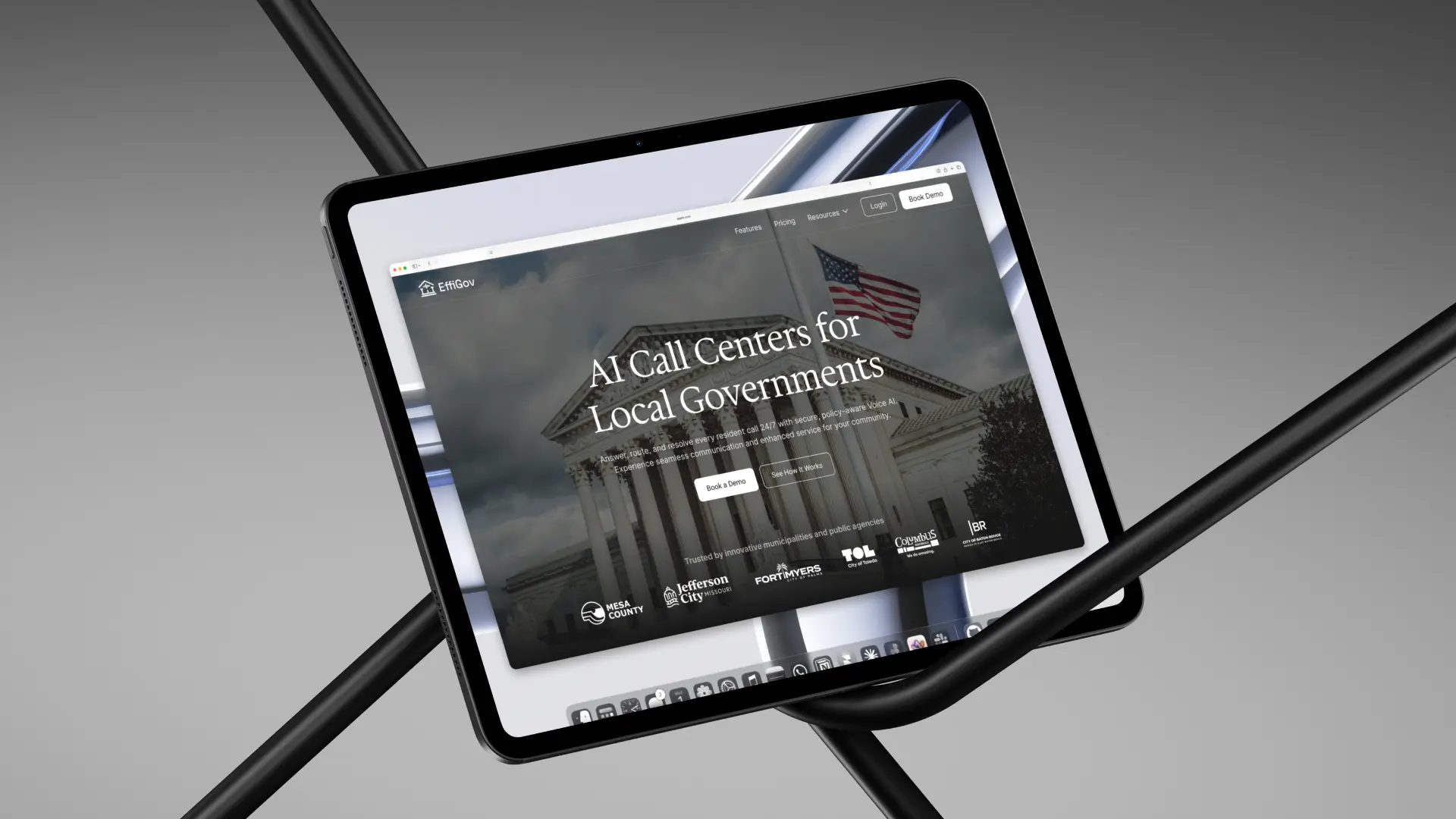
EffiGov is an early-stage product, and like many early-stage sites, the existing one-pager was functional but hadn't yet caught up to the ambition of what they were building. The opportunity was to help the site tell a stronger story: one that speaks to the specific needs of government buyers and gives them a clear reason to take the next step.
[The deliverable]
A redesigned one-pager for desktop and mobile, with a refreshed visual language and a prominent Book a Demo CTA. Success wasn't just a polished output. It was being able to explain every design decision and demonstrate confidence in running a process end-to-end.
[Research]
Without access to government decision-makers, I went deep on secondary research: 311 call center operations, local government procurement challenges, and EffiGov's own YC profile and existing site. I also mapped competitors like Rogo.ai to understand where the category was heading.
The gap was clear: most AI call tools target enterprises, not municipalities. EffiGov's differentiator (secure, policy-aware AI built for local governments) wasn't showing up anywhere on the site.
[Design direction]
"The website must feel trustworthy, modern, and civic: not too flashy or startup-y, but not boring either."
Government buyers are risk-averse. They're not moved by trendy SaaS aesthetics, but they need to feel that a vendor is credible. The site needed to sit in the middle: polished enough to feel serious, human enough to feel approachable.
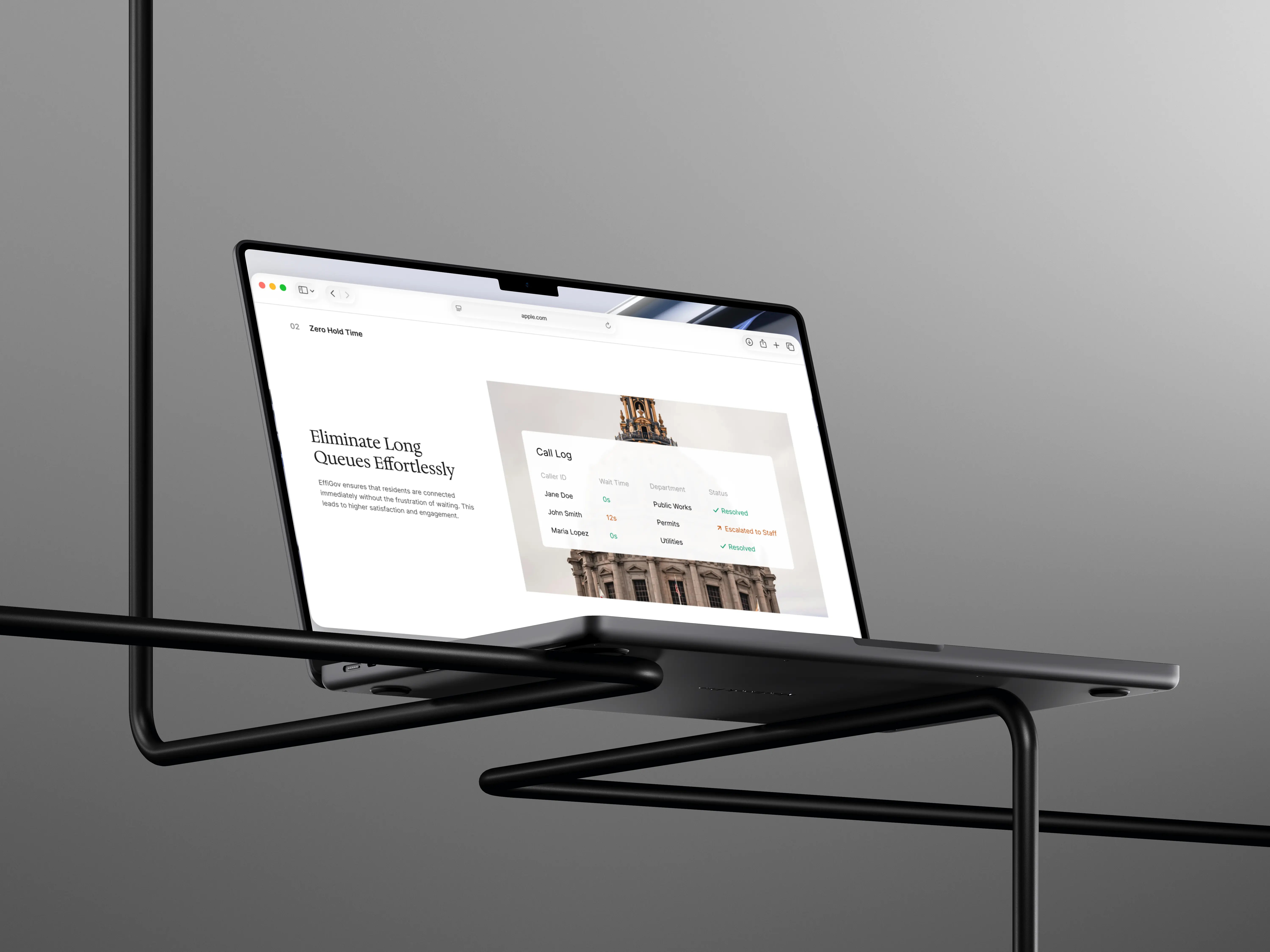
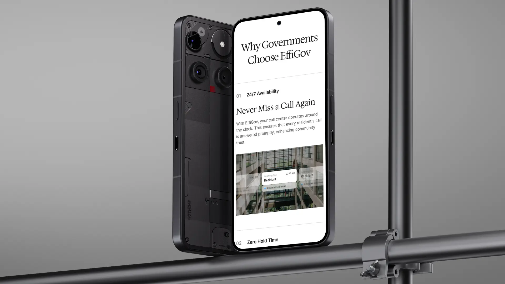
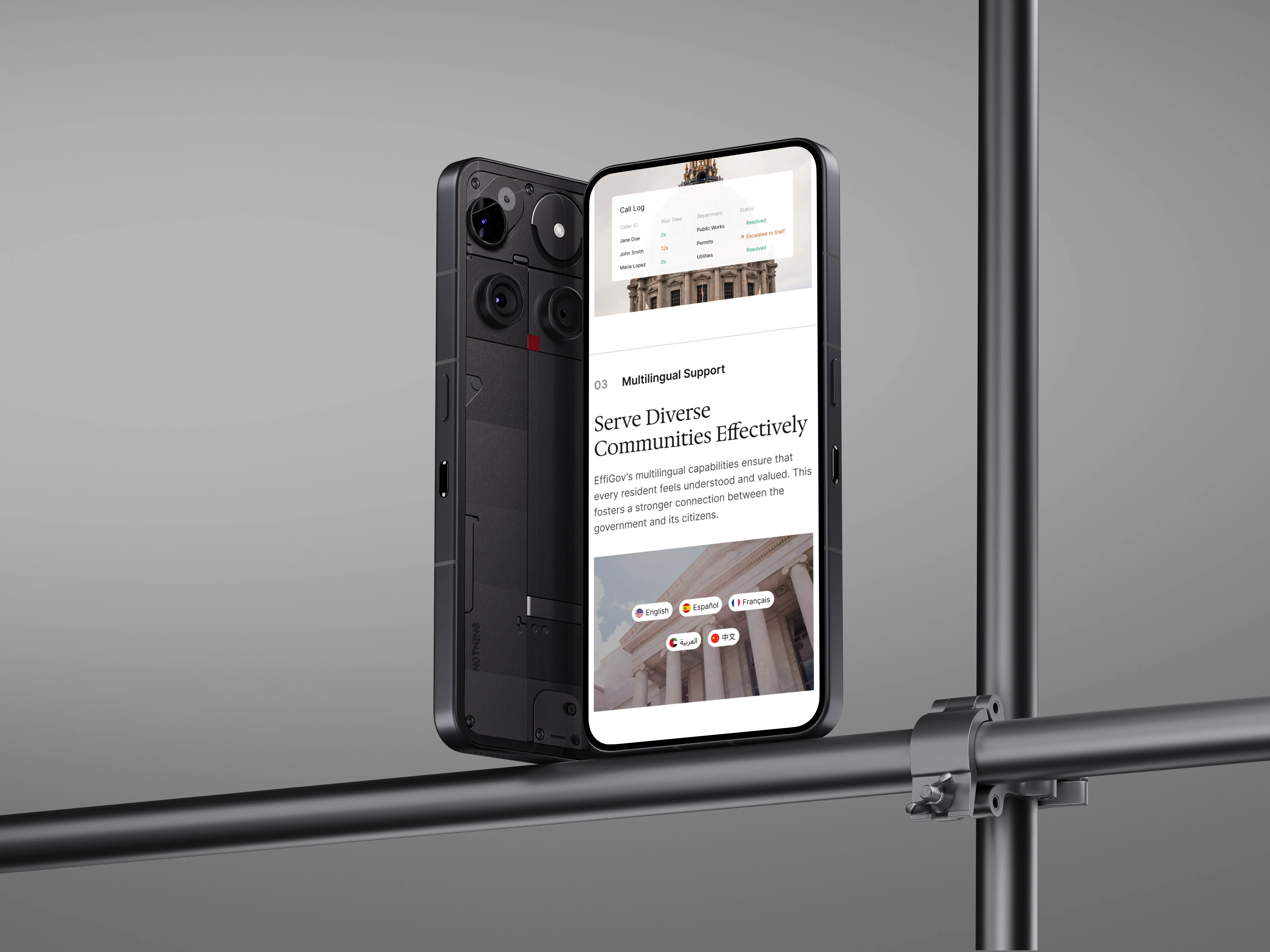
Civic imagery (government buildings, official photography, architecture) carries institutional authority that abstract tech visuals can't. That became the visual foundation.
[Structure]
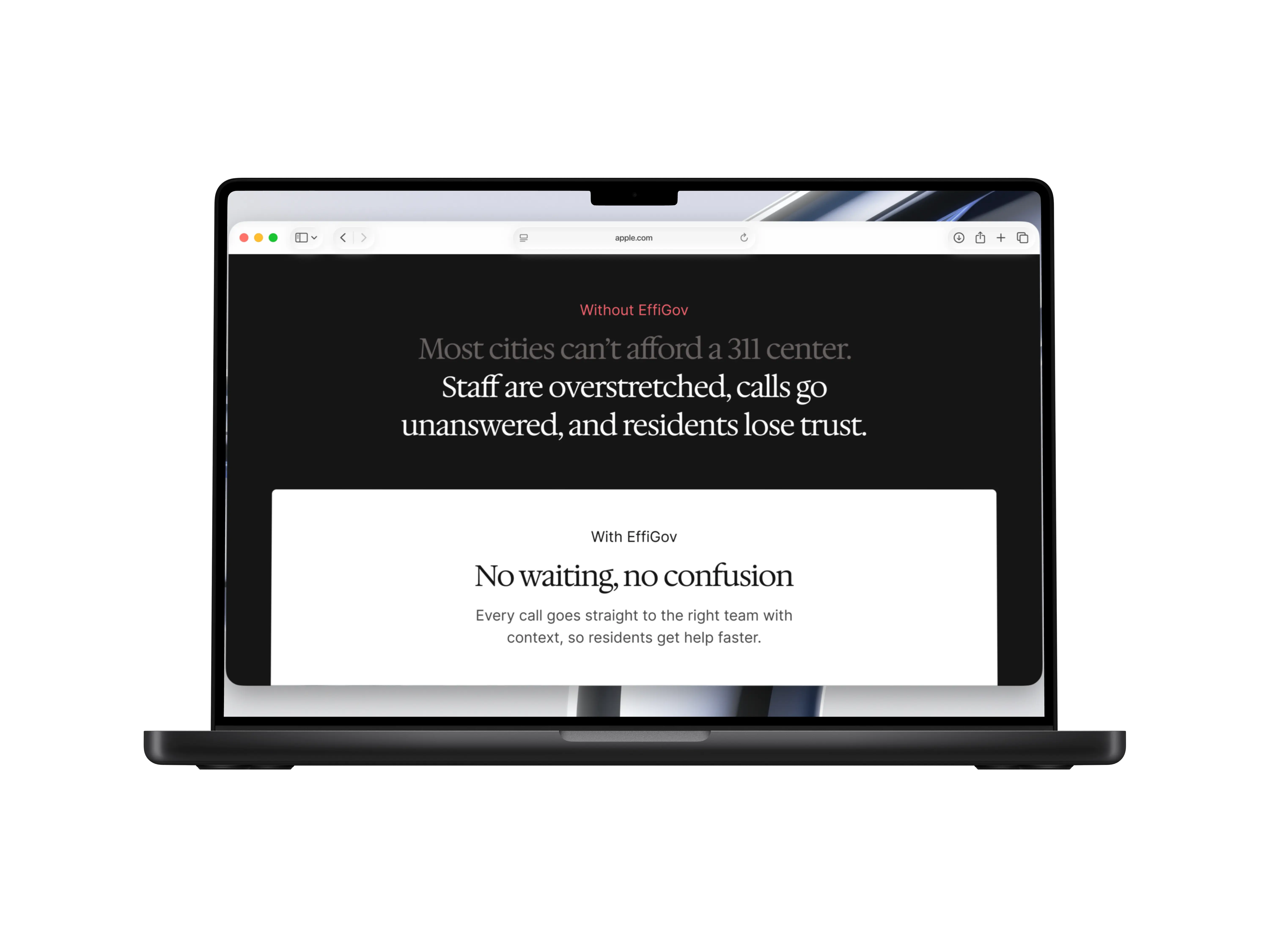
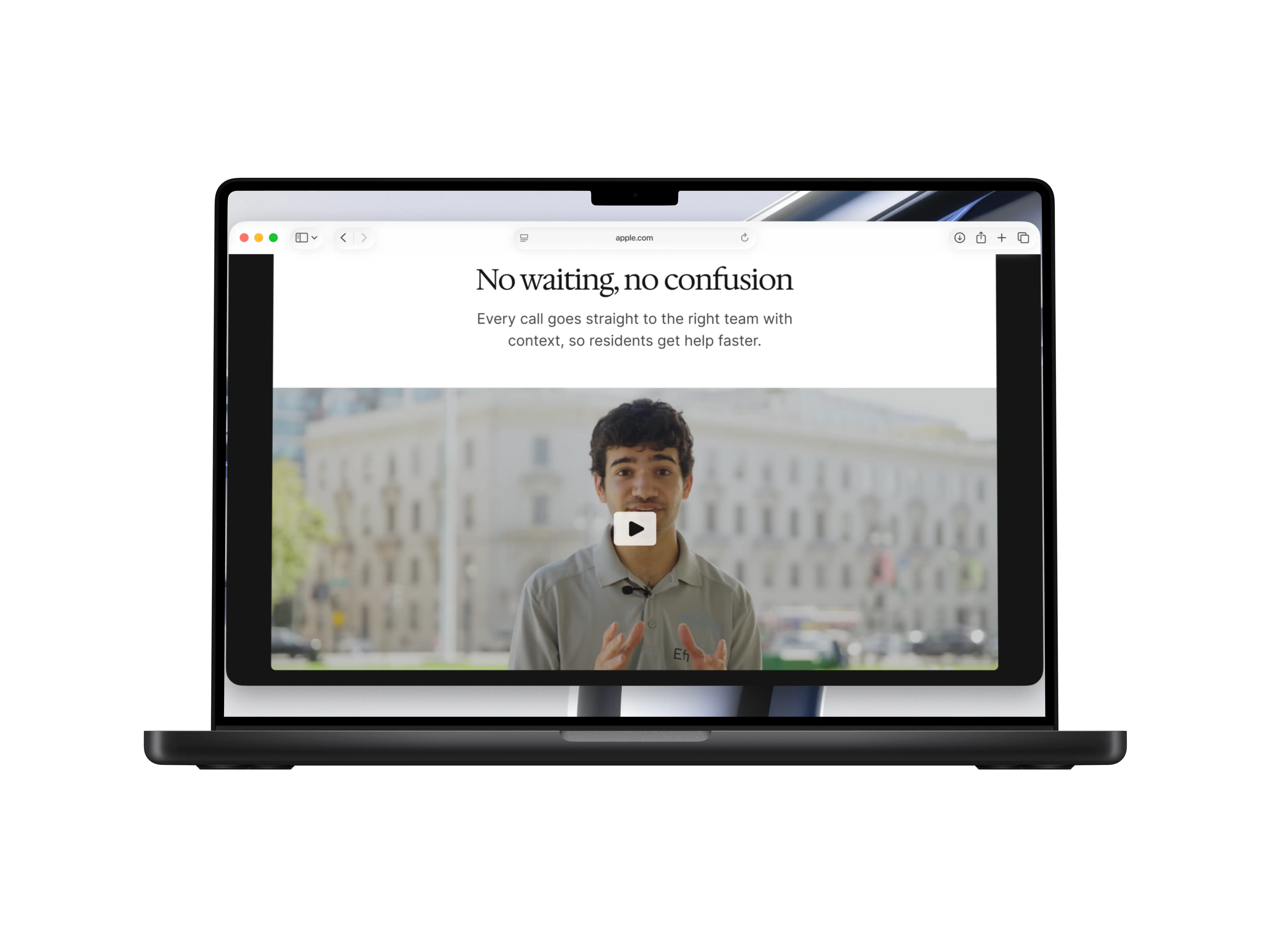
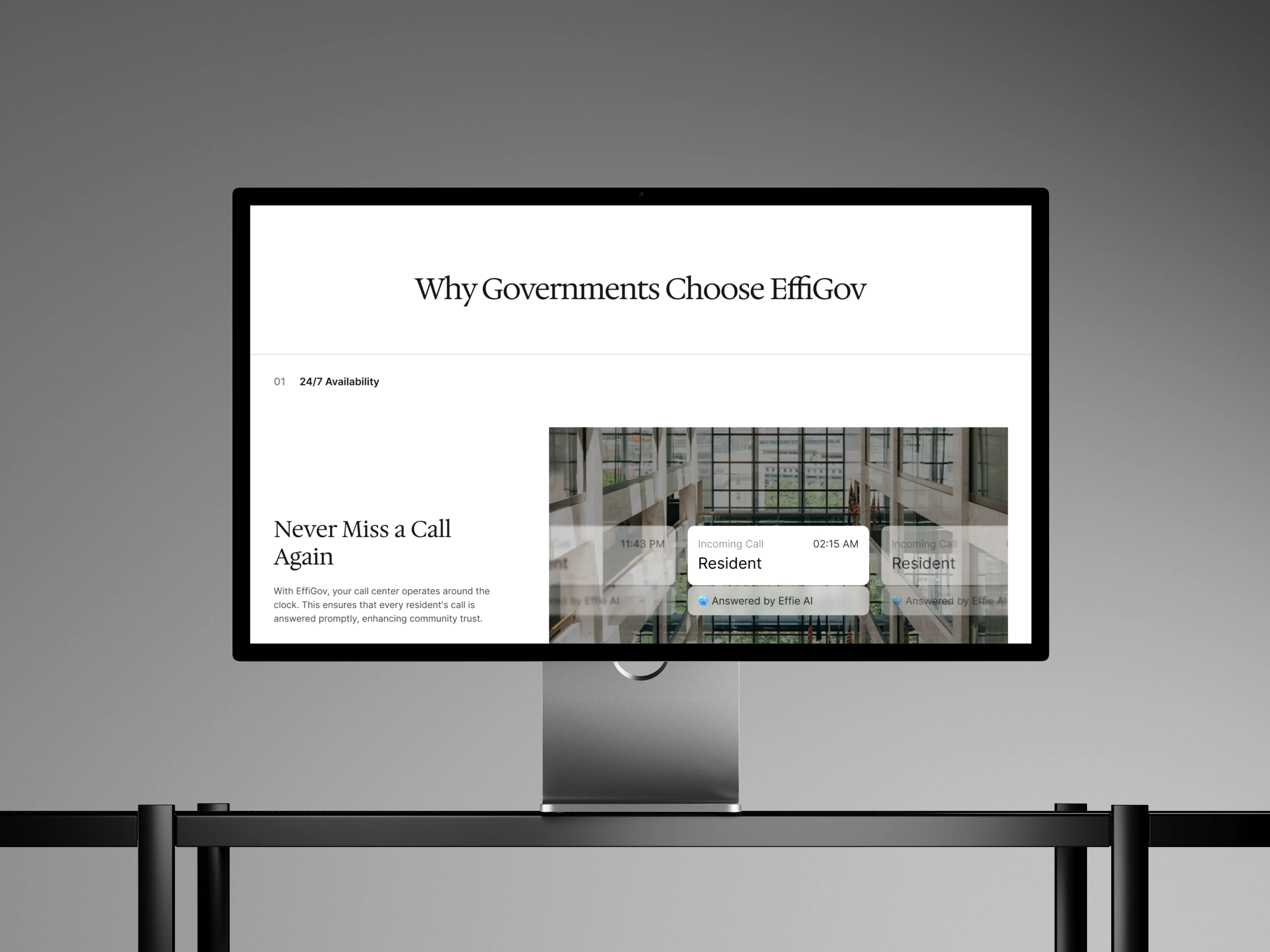
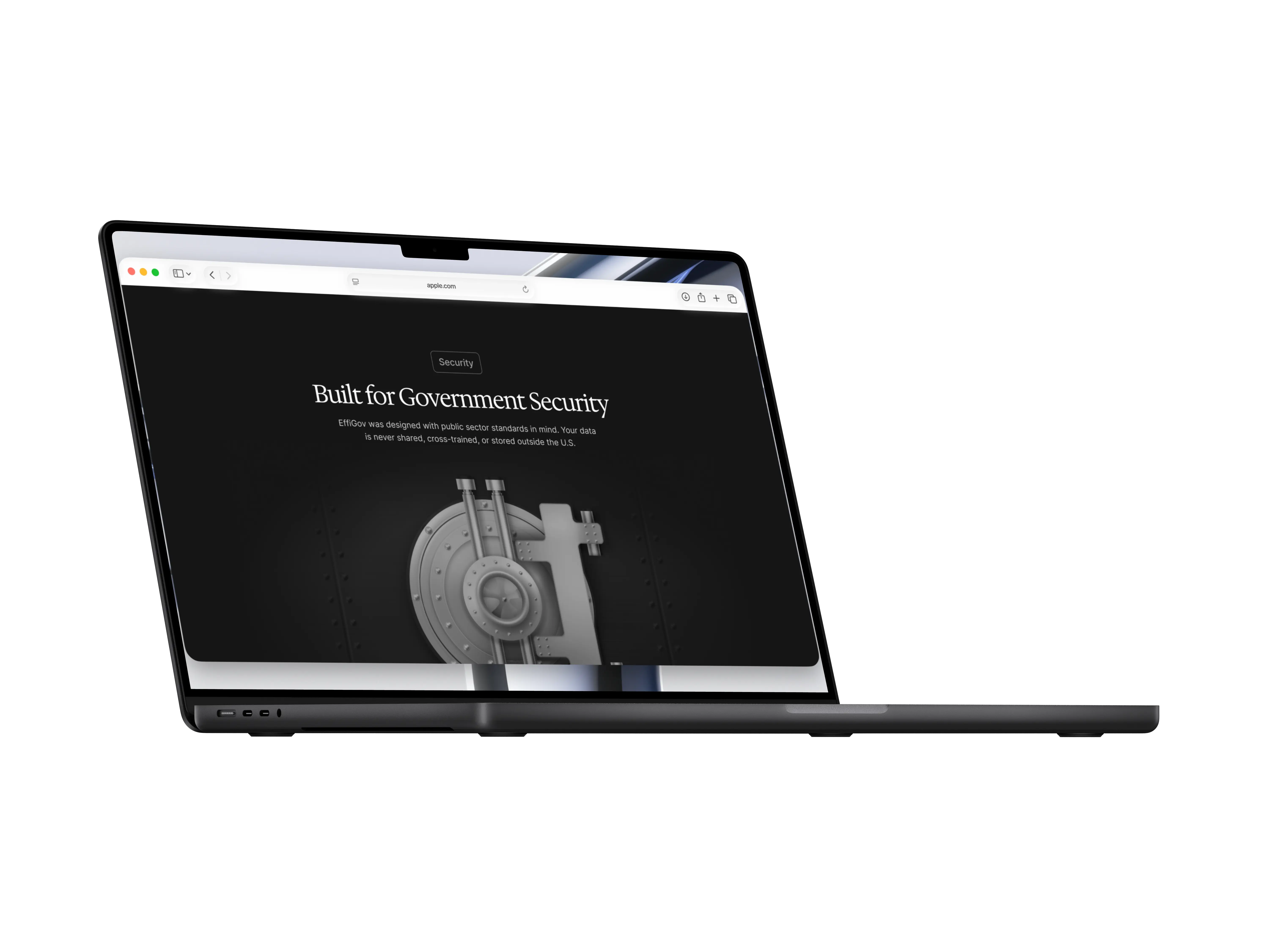
I converged on a flow that leads with the problem, moves through the solution and features, then builds toward trust through security signals, social proof, and an FAQ before the final CTA.
[Visual language]
A dual-tone palette of dark charcoal and white, with teal accents tied back to civic color conventions. Dark sections signal security and authority. Light sections give content room to breathe. Alternating the two creates a natural scroll rhythm.
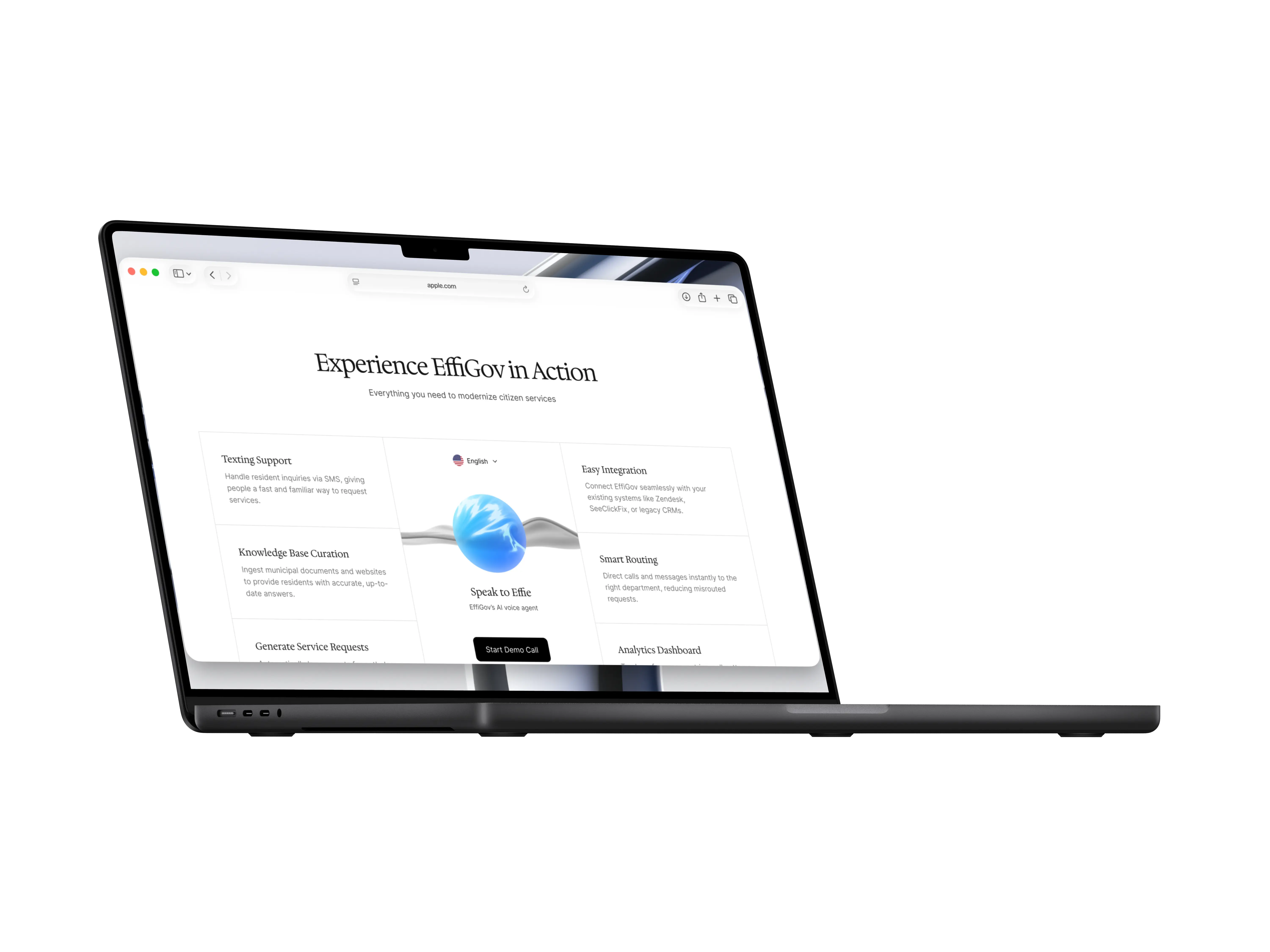
A mid-page "Speak to Effie" demo section lets visitors hear the AI voice agent in 30 seconds, lowering the barrier to engagement before asking anyone to commit to a call.
[Build]
Designed in Figma, built end-to-end in Framer with no developer handoff. Working directly in the production tool meant I could pressure-test layout decisions in real scroll behavior and validate animations as part of the same workflow.
[Outcome]
The redesigned site communicates EffiGov's value proposition in a way that matches the ambition of the product. Cohort feedback highlighted the improved visual hierarchy, the before/after problem framing, and the shift from generic SaaS to civic credibility.
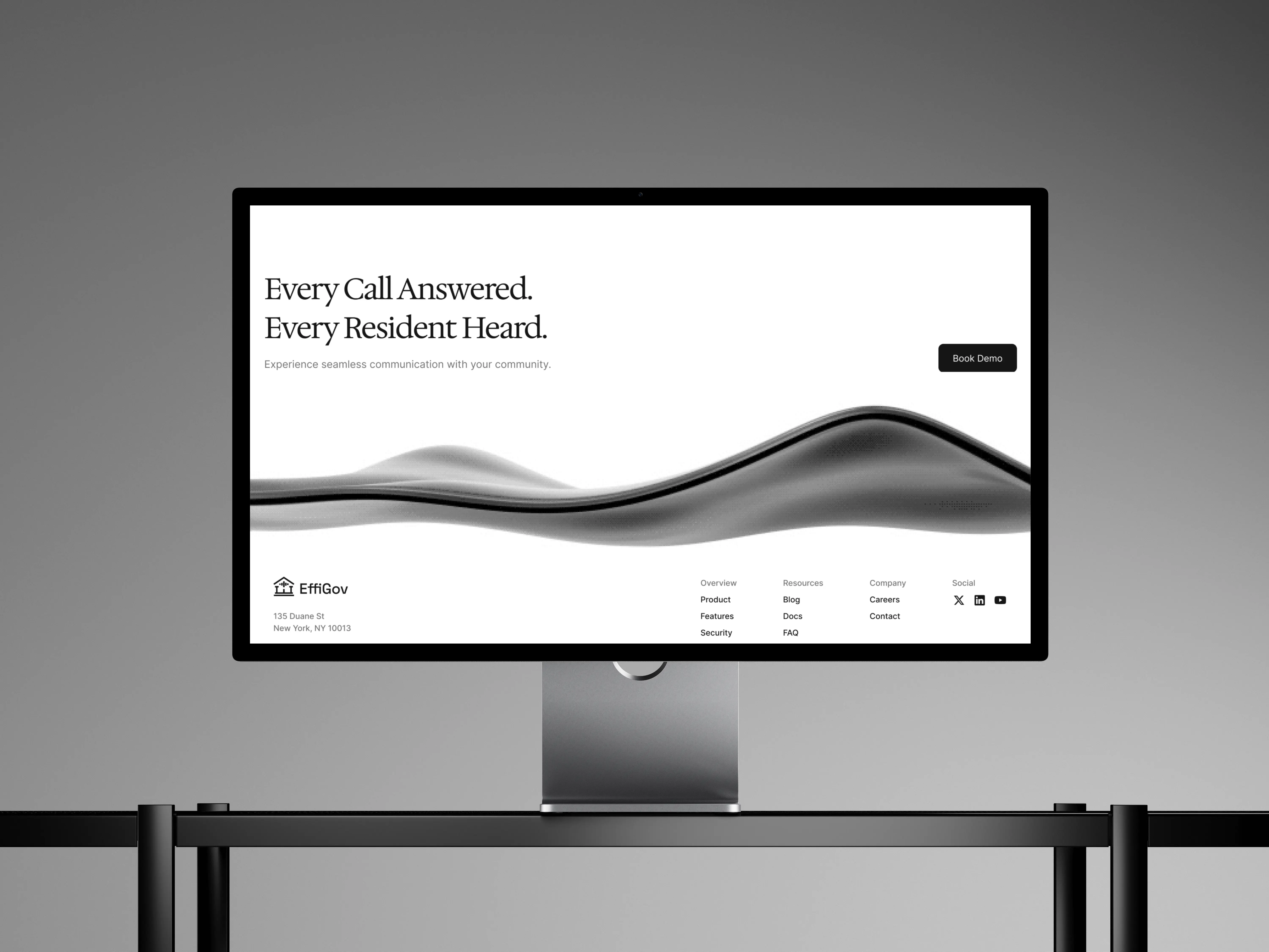
From
Minimal, uninspiring one-pager
To
A civic-credible platform built to communicate trust and drive demos